Building a
B2B Money Transfer
MVP.
Role
Sole Designer
Duration
1 Month
Deliverables
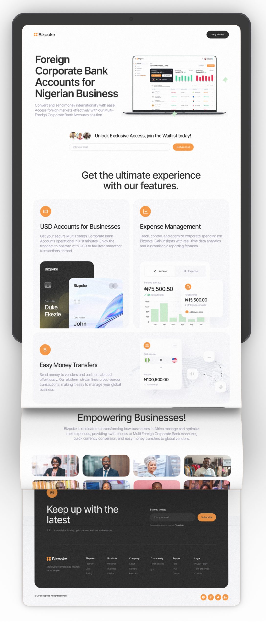
Responsive Web App
Brand Identity
Pitch Deck
Website
Tools
Figma, Photoshop
Illustrator
The Challenge
After receiving a PRD for a seamless international money transfer product for businesses, I was faced with several design-specific challenges. One major challenge was designing an interface that complied with complex international regulatory requirements while remaining user-friendly. Ensuring robust security without overwhelming the user with technical details was another critical design aspect. Additionally, building a highly intuitive interface that catered to users of diverse ages and technical abilities required a deep understanding of user behavior and needs. Furthermore, I had to design a visually appealing yet functional interface that could differentiate Bizpoke from competitors in a crowded market.

Due to the sensitivity of the project, this case study is heavily redacted to protect the client.
The Solution
My design solutions focused on creating a user-centric, simple, and visually appealing product. I started by designing a streamlined user interface with clear, intuitive navigation to simplify transactions. Incorporating feedback from usability testing, I refined the design to enhance the overall user experience, ensuring that every element of the app was intuitive and accessible, making international money transfers straightforward and hassle-free.
The Fast-Paced Design Journey
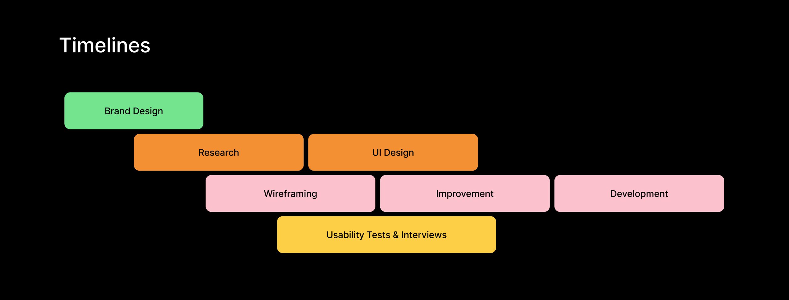
The design process for Bizpoke’s MVP was intense and fast-paced, with a timeline of less than a month to deliver. I began with rapid research and analysis, swiftly conducting market research and competitor analysis to identify opportunities and user pain points. This was followed by quick iterations of wireframing and prototyping, creating wireframes and interactive prototypes to visualize the app’s structure and flow. User testing was conducted in parallel to gather immediate feedback from real users, allowing me to make real-time refinements.
Establishing Bizpoke's Brand
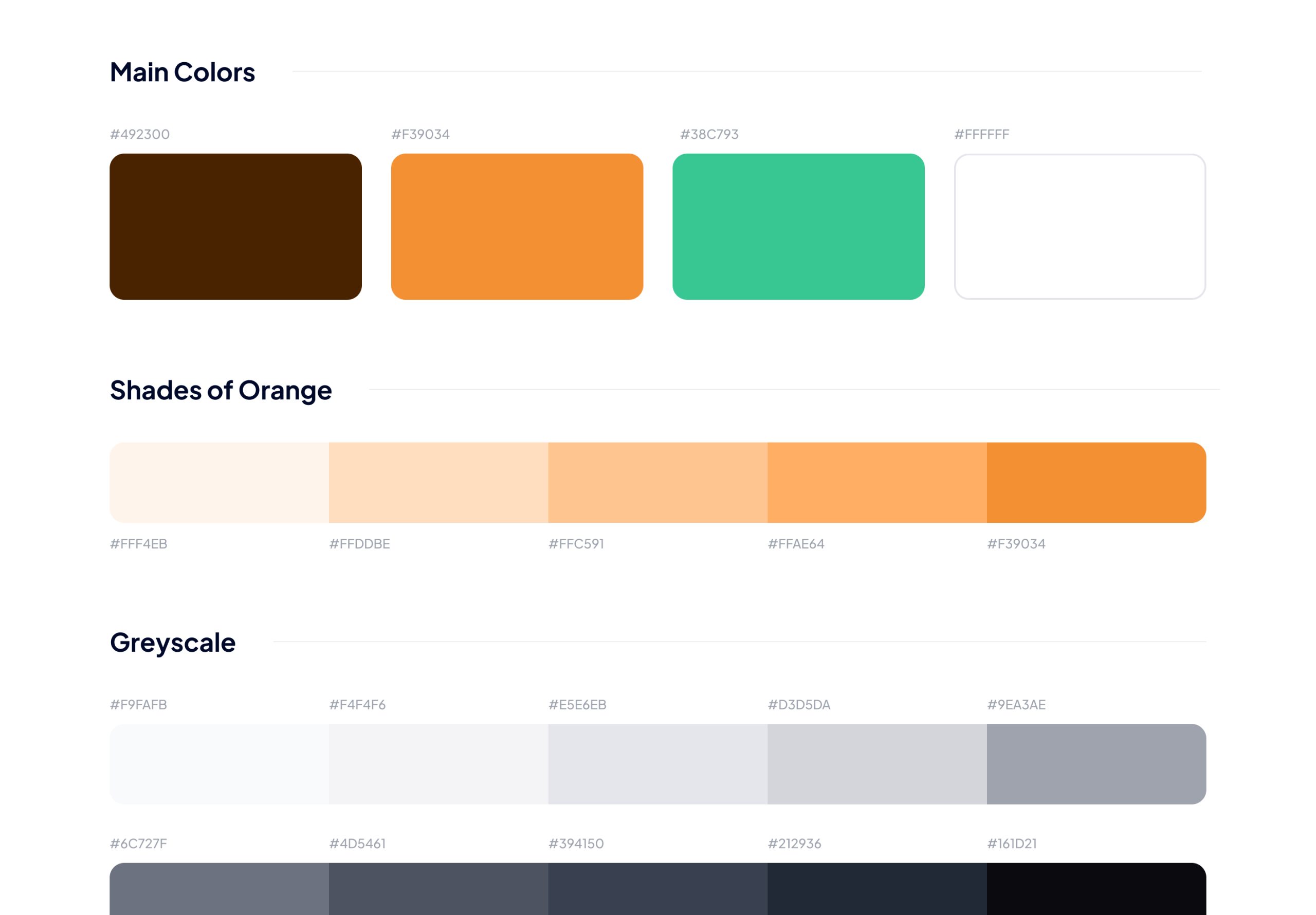
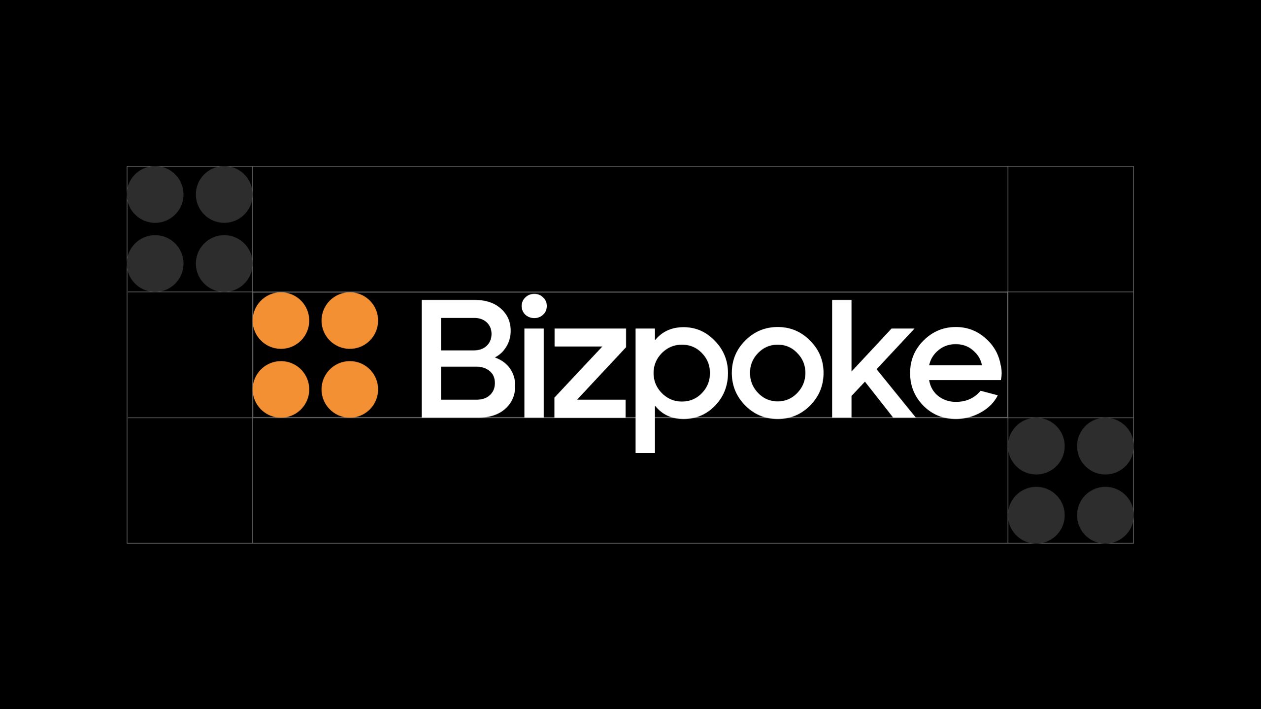
In crafting Bizpoke’s brand identity, I designed a logo that embodies the essence of our multi-currency B2B product. The logo features four circles arranged in pairs, with two circles positioned upward and two downward, symbolizing the diverse range of currencies supported by Bizpoke. The primary color of the logo is vibrant orange, chosen to evoke energy, creativity, and confidence. This color choice reflects Bizpoke’s dynamic and innovative approach to international money transfers. By creating a visually striking logo that encapsulates the core attributes of our product, we aim to establish a strong and memorable brand identity that resonates with our target audience.
Simple Architectures for Complex Financial Needs
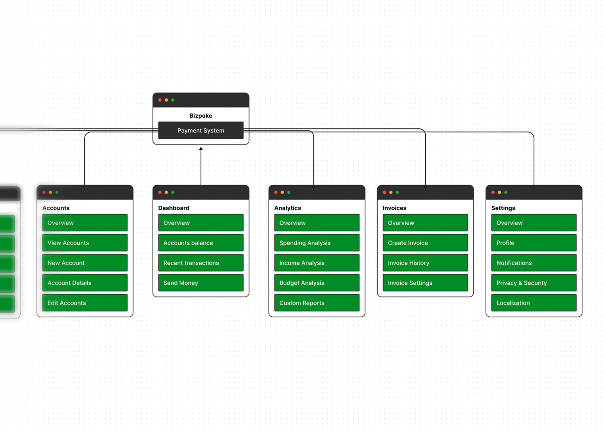
The information architecture was structured to ensure easy navigation and quick access to key features. I mapped out user flows to streamline the process of sending and receiving money, and designed a clear and concise navigation menu to access different modules easily. Information was logically categorized to improve discoverability and user experience, ensuring that users could find what they needed without hassle.
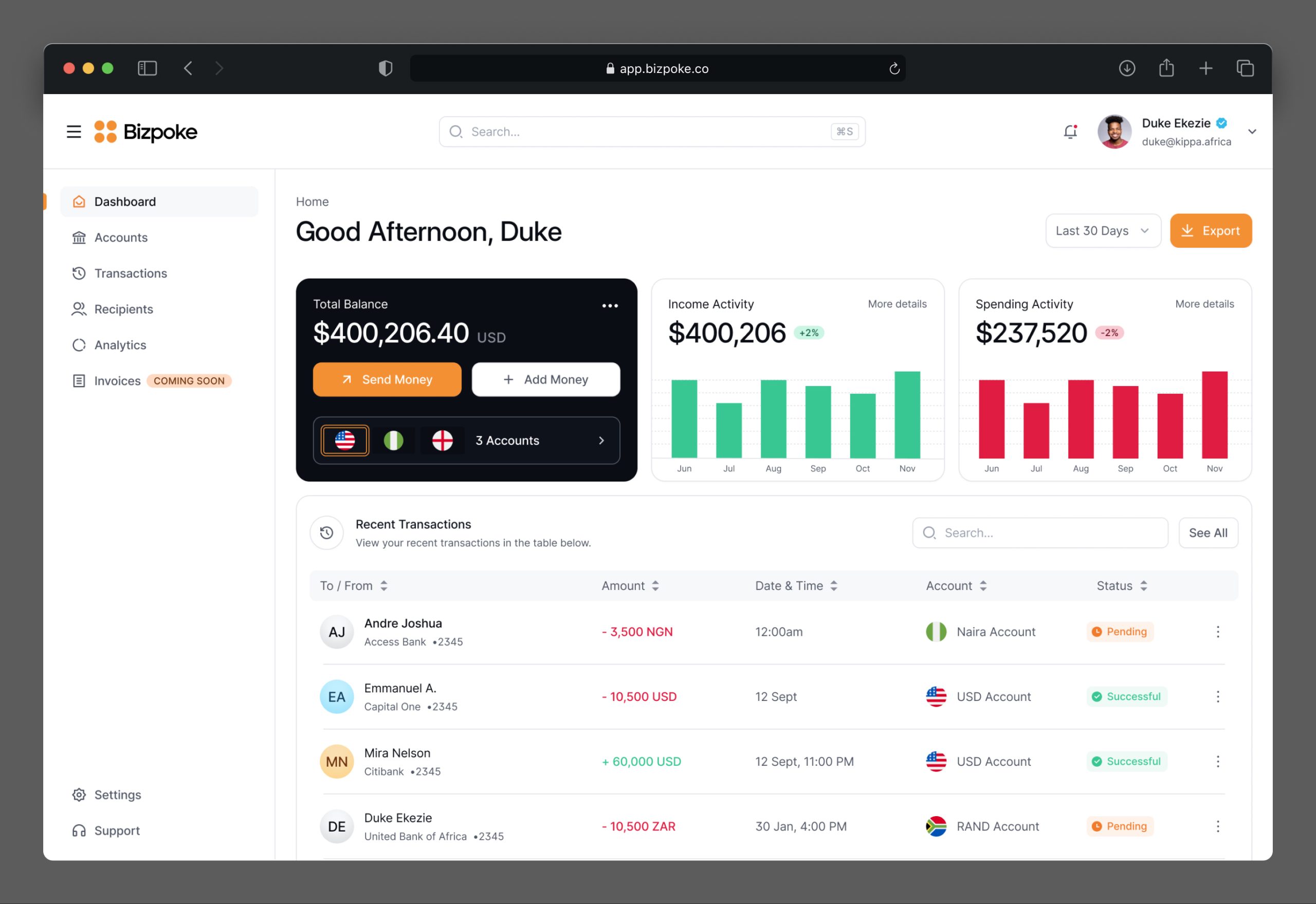
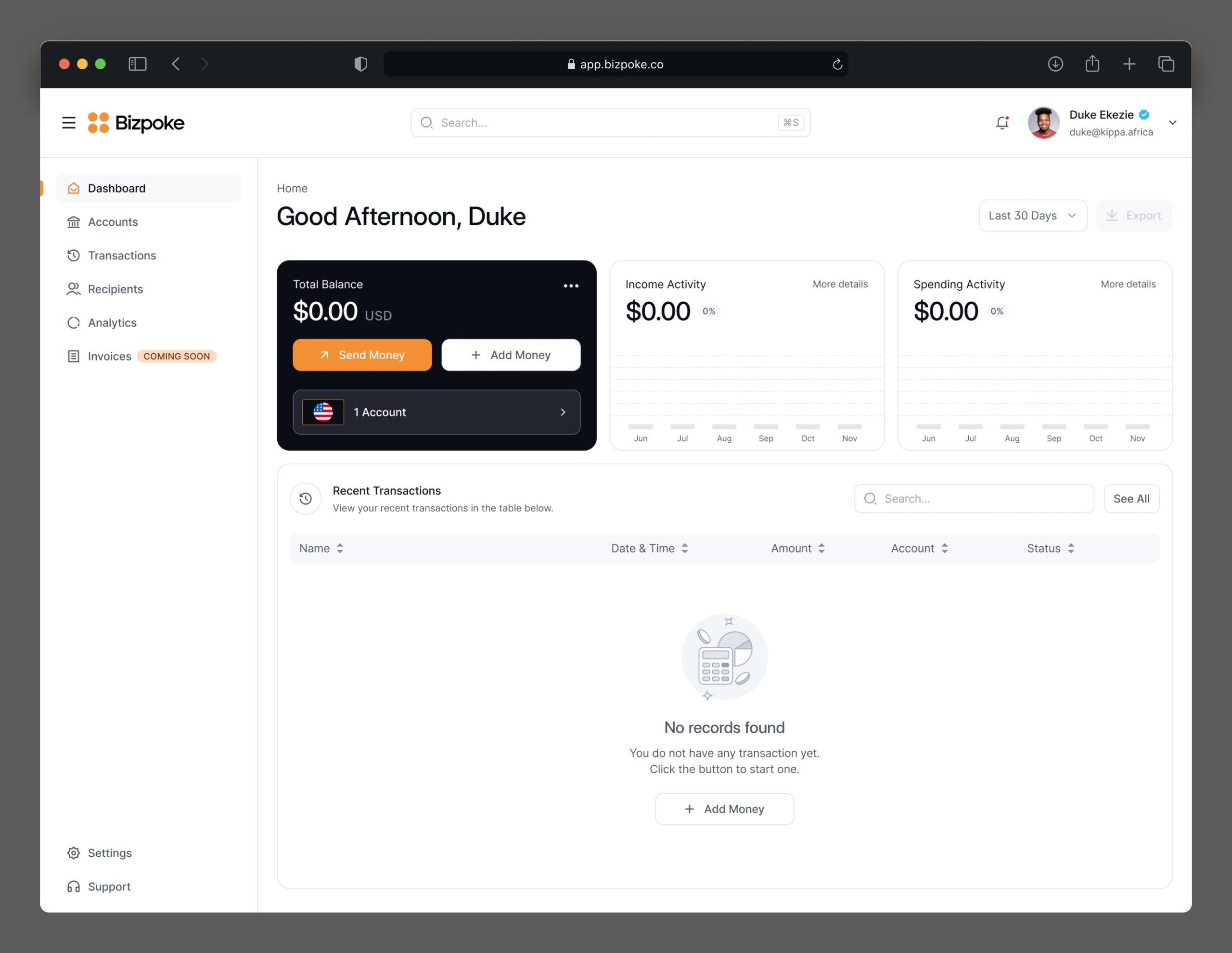
Simplified and Powerful Dashboard
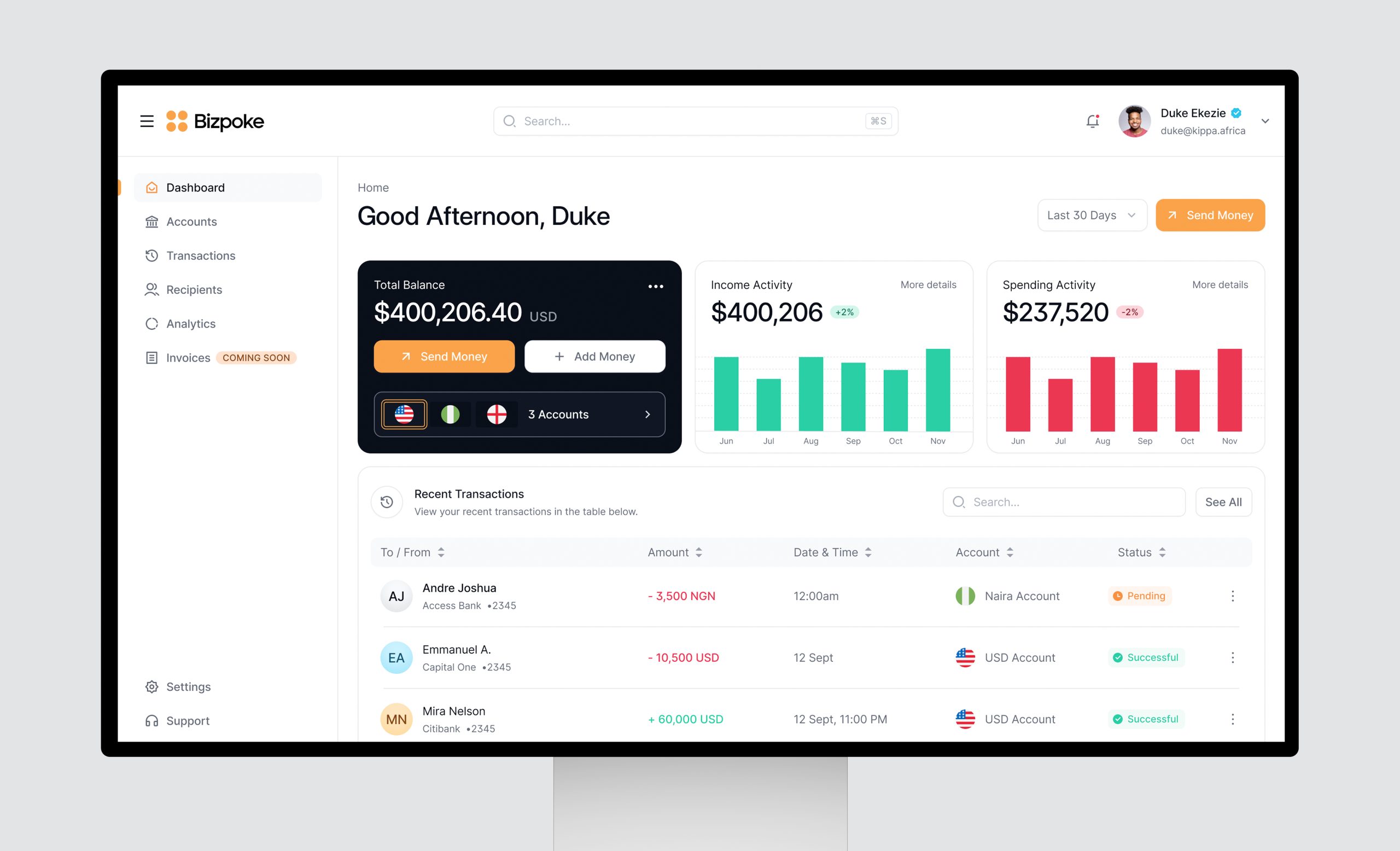
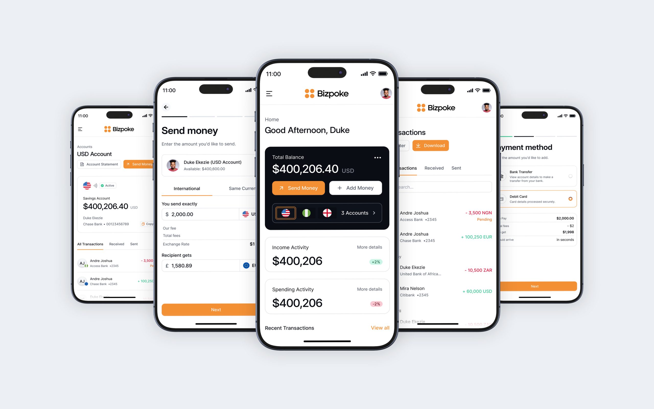
The dashboard module was designed to provide users with a comprehensive overview of their transactions and account activities. It included detailed transaction history, giving users access to past transaction records, and an account summary, providing a snapshot of their account balance and recent activities. Alerts and notifications were integrated to keep users informed about important updates and required actions, enhancing their overall experience.
Streamlined onboarding
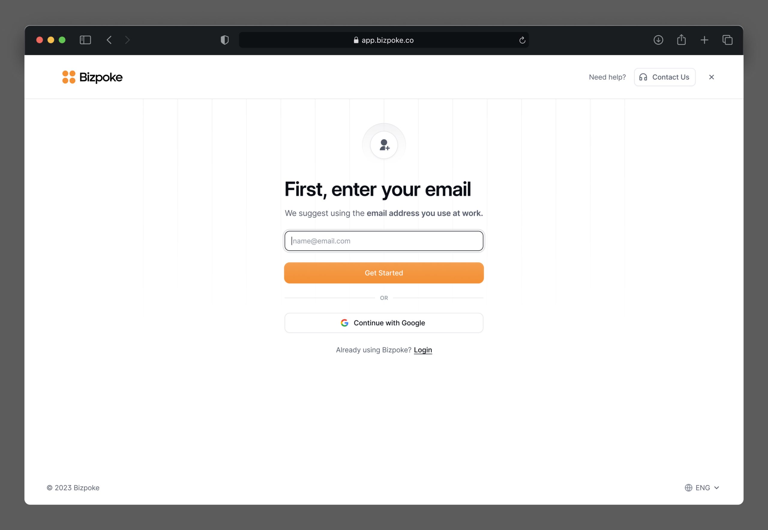
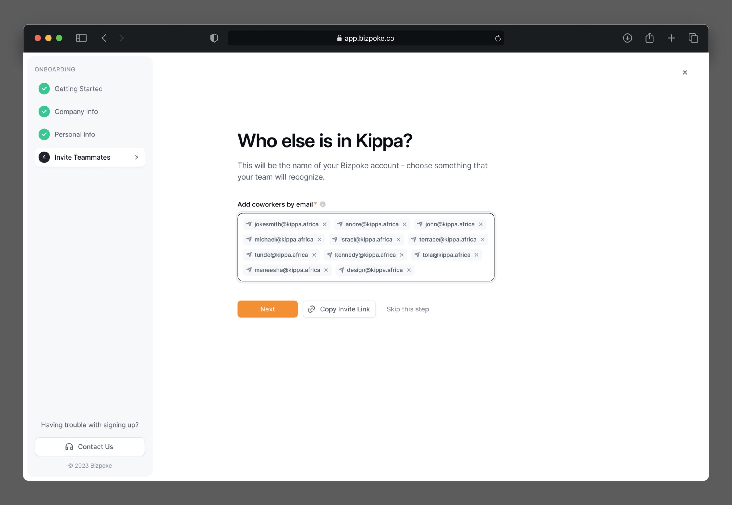
I designed a streamlined onboarding process to guide users through setting up their Bizpoke accounts efficiently. The onboarding screens prompt users to enter the required information for sign-up, including personal data and any additional company data mandated by regulators. This ensures that users complete the necessary steps to comply with regulatory requirements while signing up for their Bizpoke accounts. Additionally, users are guided through the process of setting up their account preferences and security settings to tailor their Bizpoke experience to their needs.
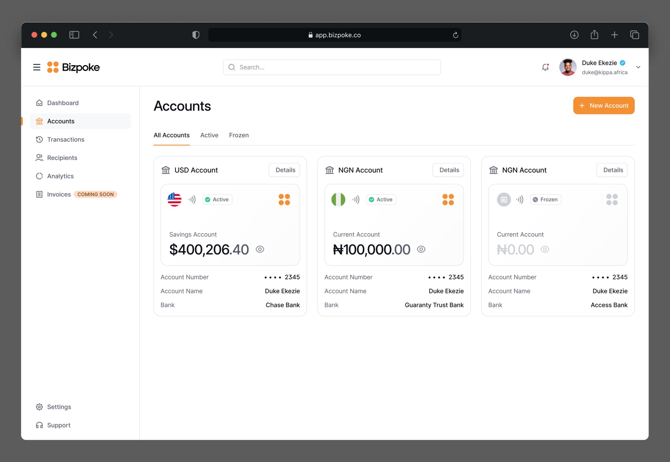
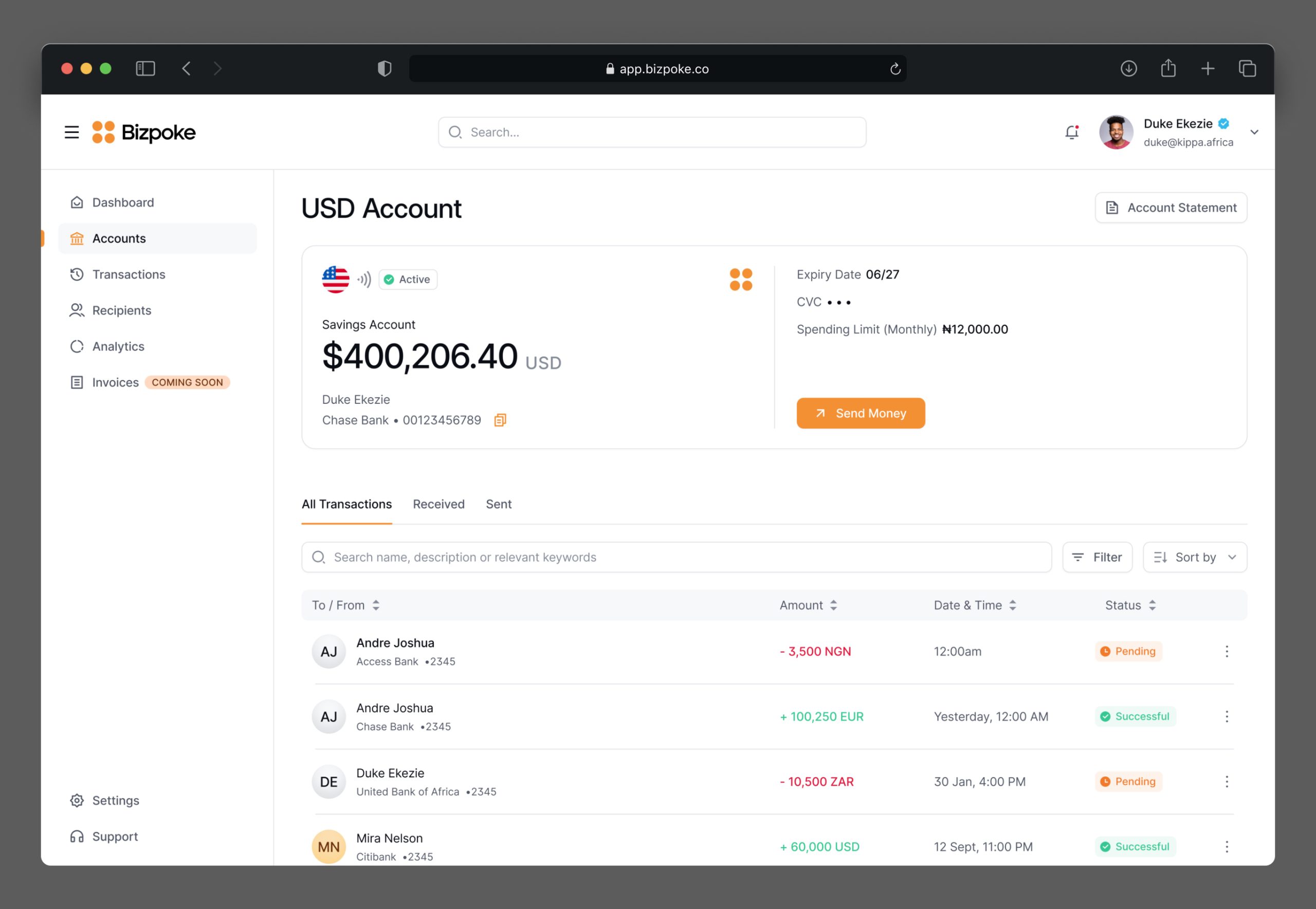
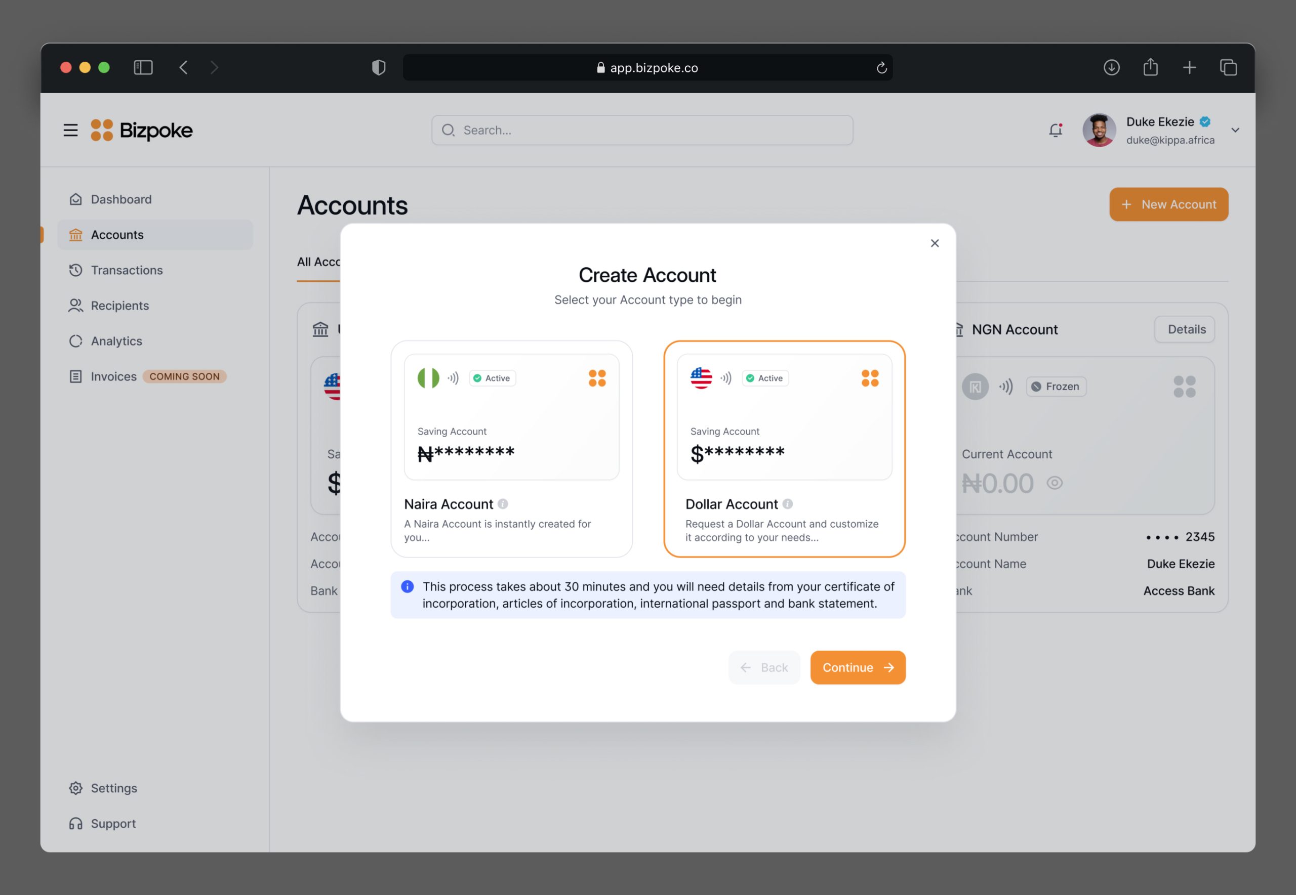
Account Management
Designed to cater to user’s multiple currencies. Each user can have different accounts for various currencies, allowing them to easily view and manage their finances in one place. Users can view balances, account statements, and track their transaction histories for each currency. This design ensures that managing multiple currencies is seamless and intuitive, providing users with full control over their international finances.
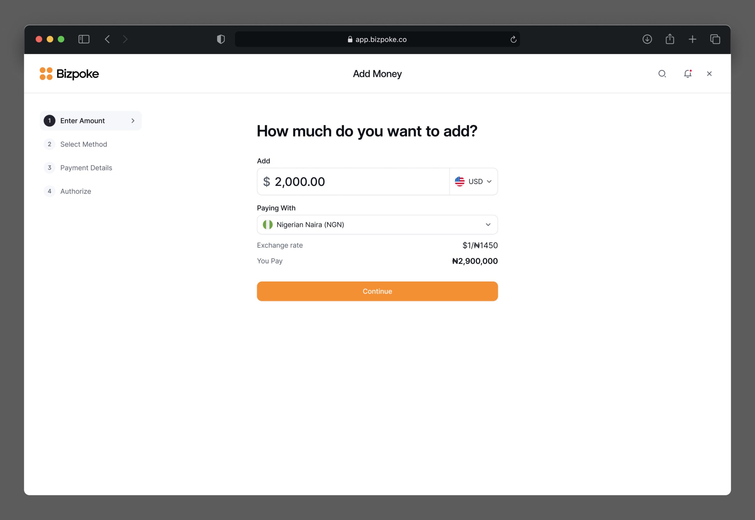
Seamless transactions
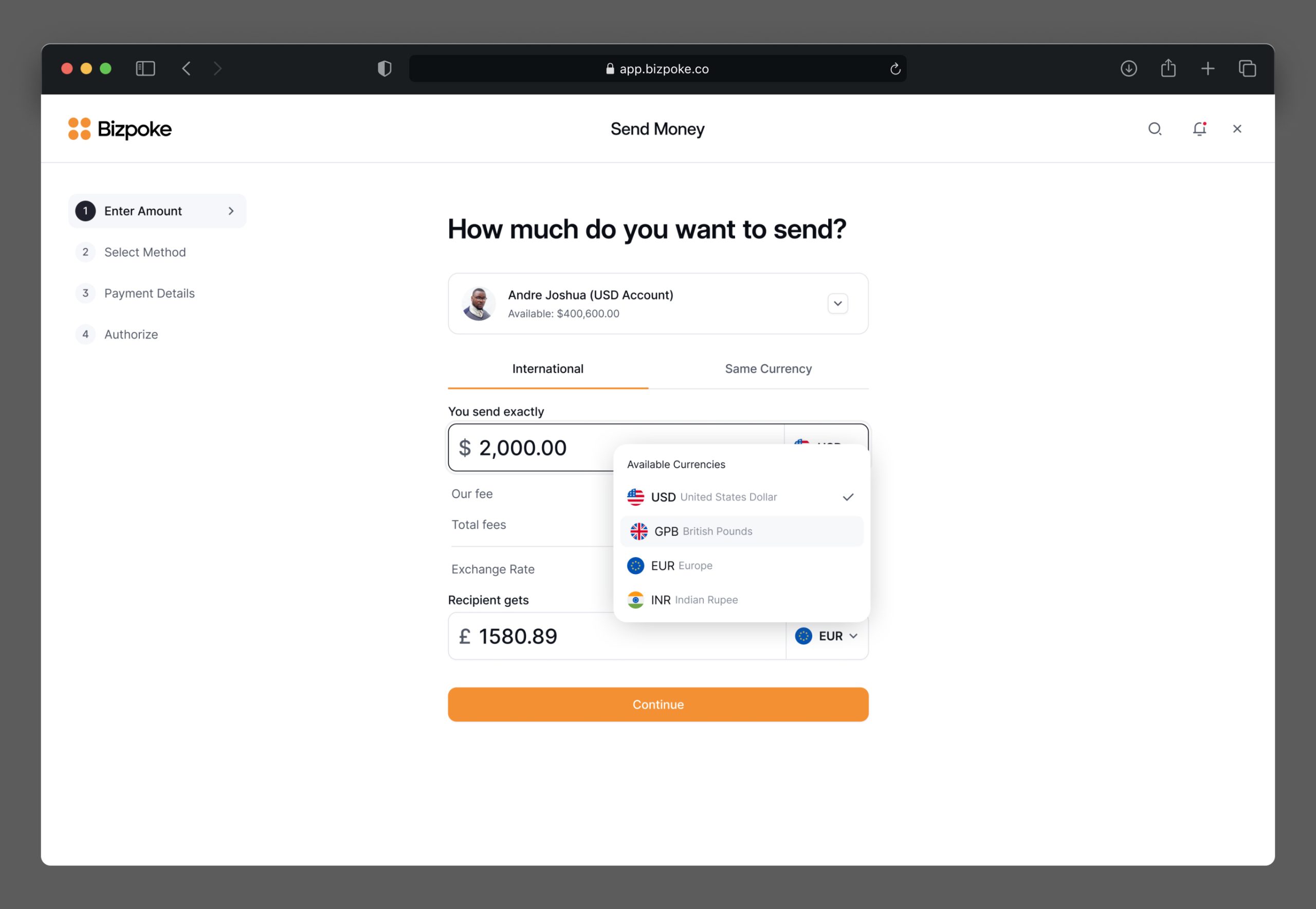
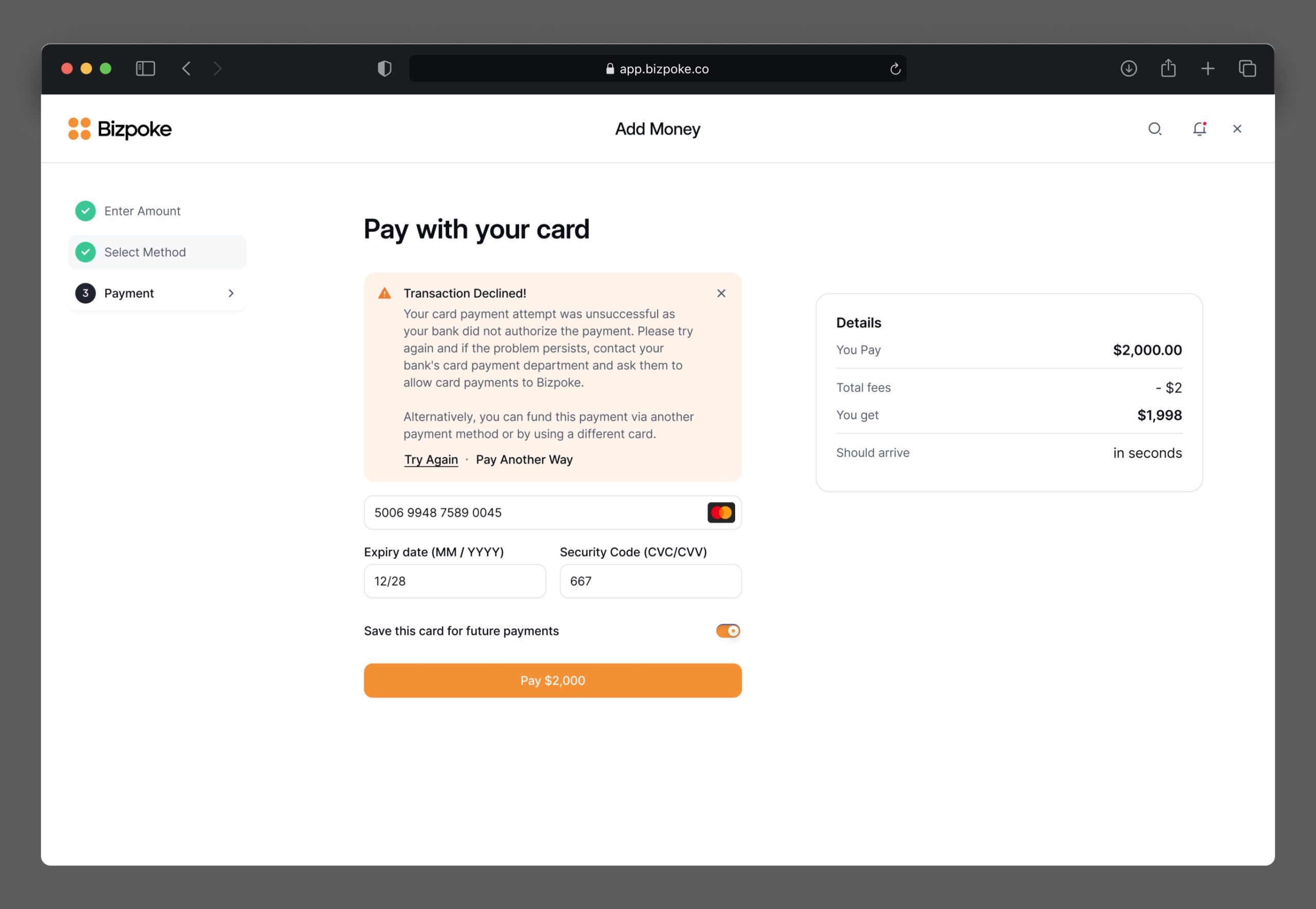
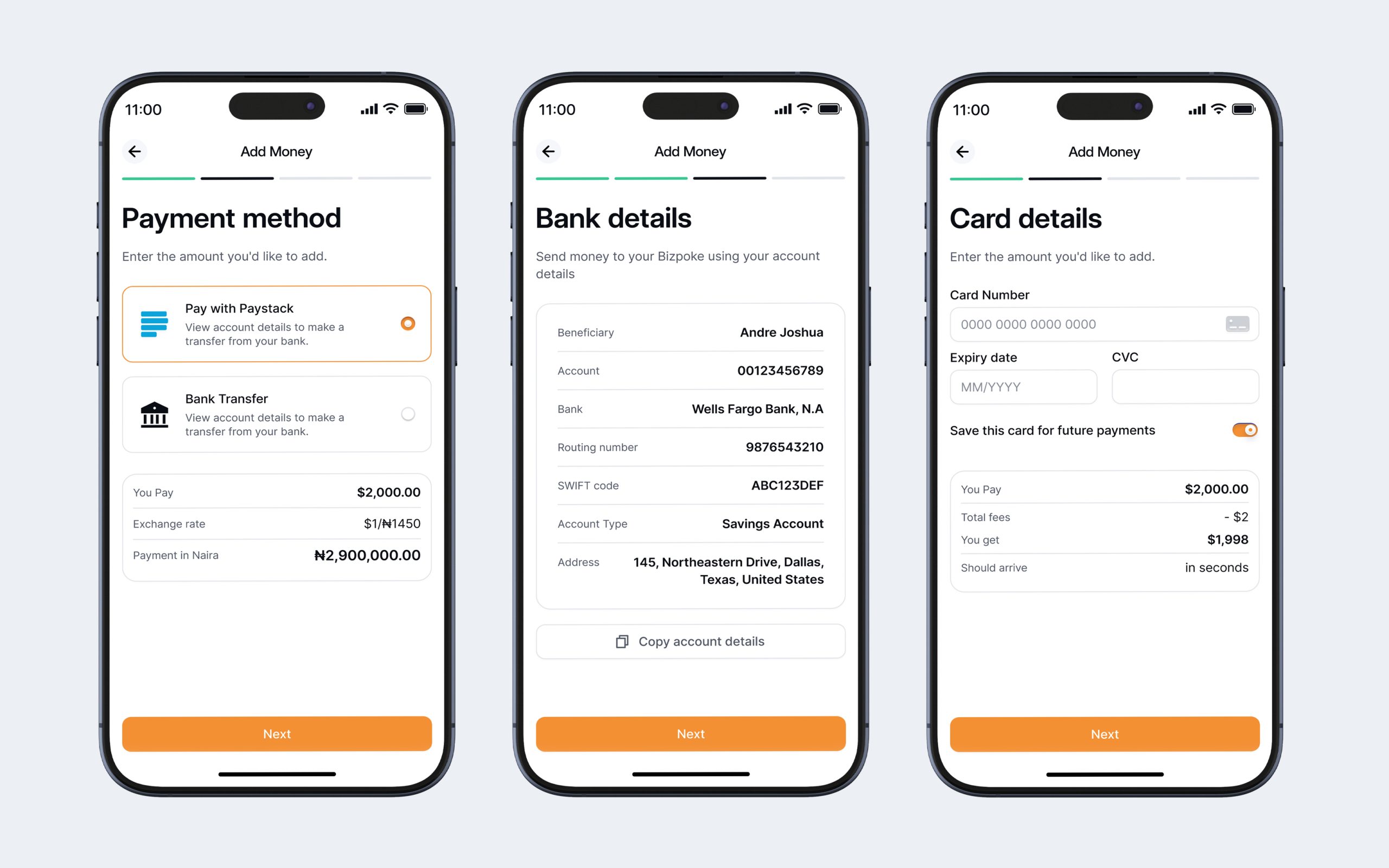
The payment module was central to the app’s functionality, facilitating easy and secure transactions. Users could transfer funds seamlessly, with support for various payment options, including bank transfers, credit/debit cards, and digital wallets. A clear and concise transaction confirmation process was implemented to ensure that users were always aware of their transaction status.
Recipients
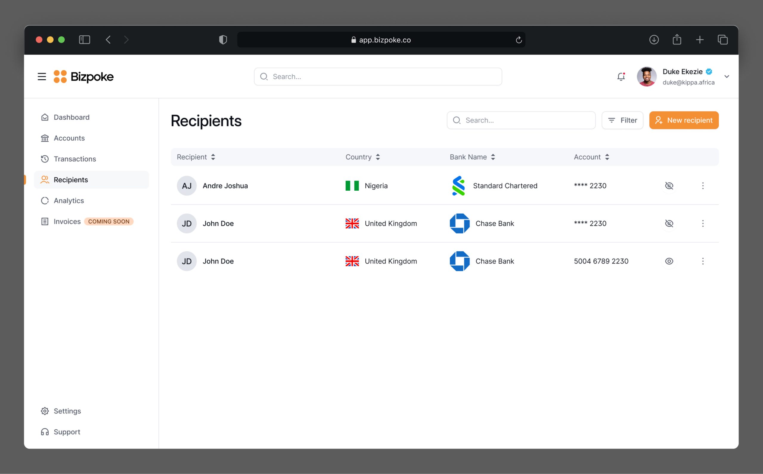
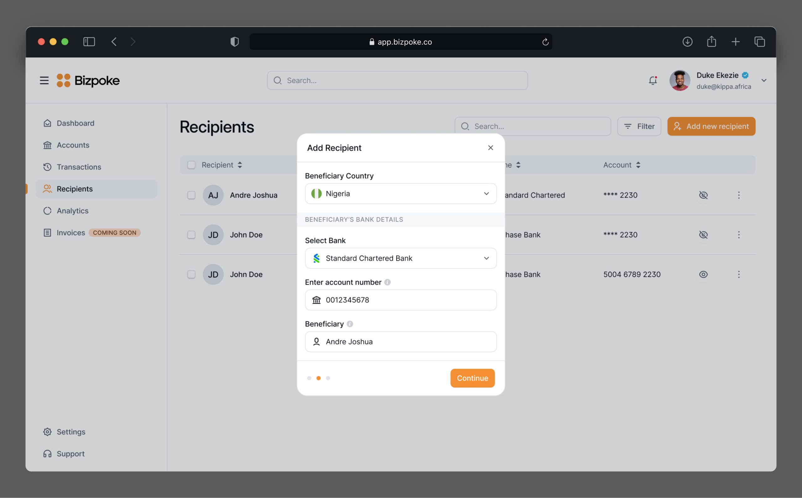
The recipient module was designed to manage and interact with recipients effectively. Users could easily add new recipients, manage existing recipient information, and view recipient history to reference past interactions. This module ensured that users could keep track of their recipients and manage their contacts efficiently.

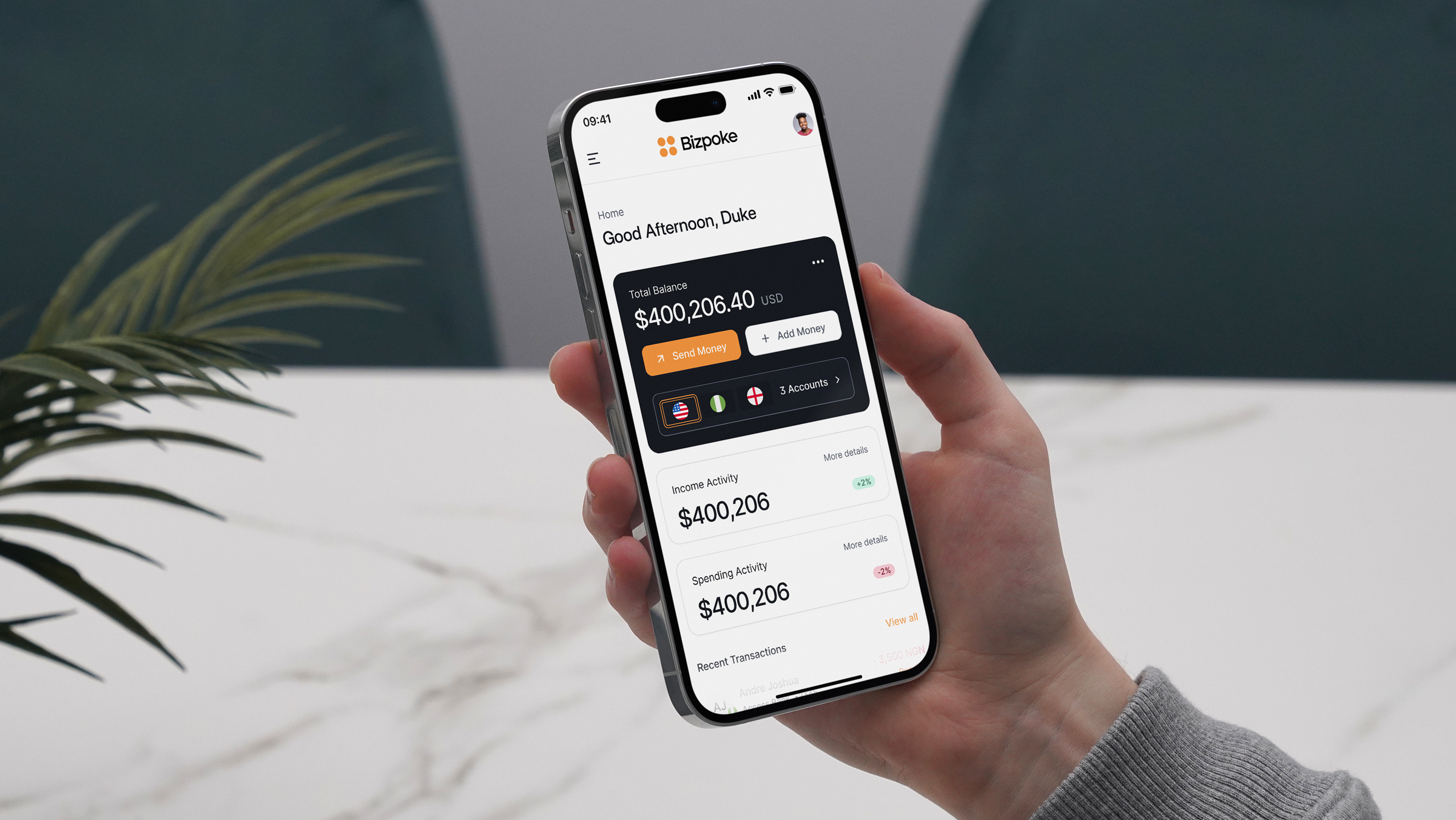
Mobile simplicity, send money effortlessly with intuitive transactions on-the-go.
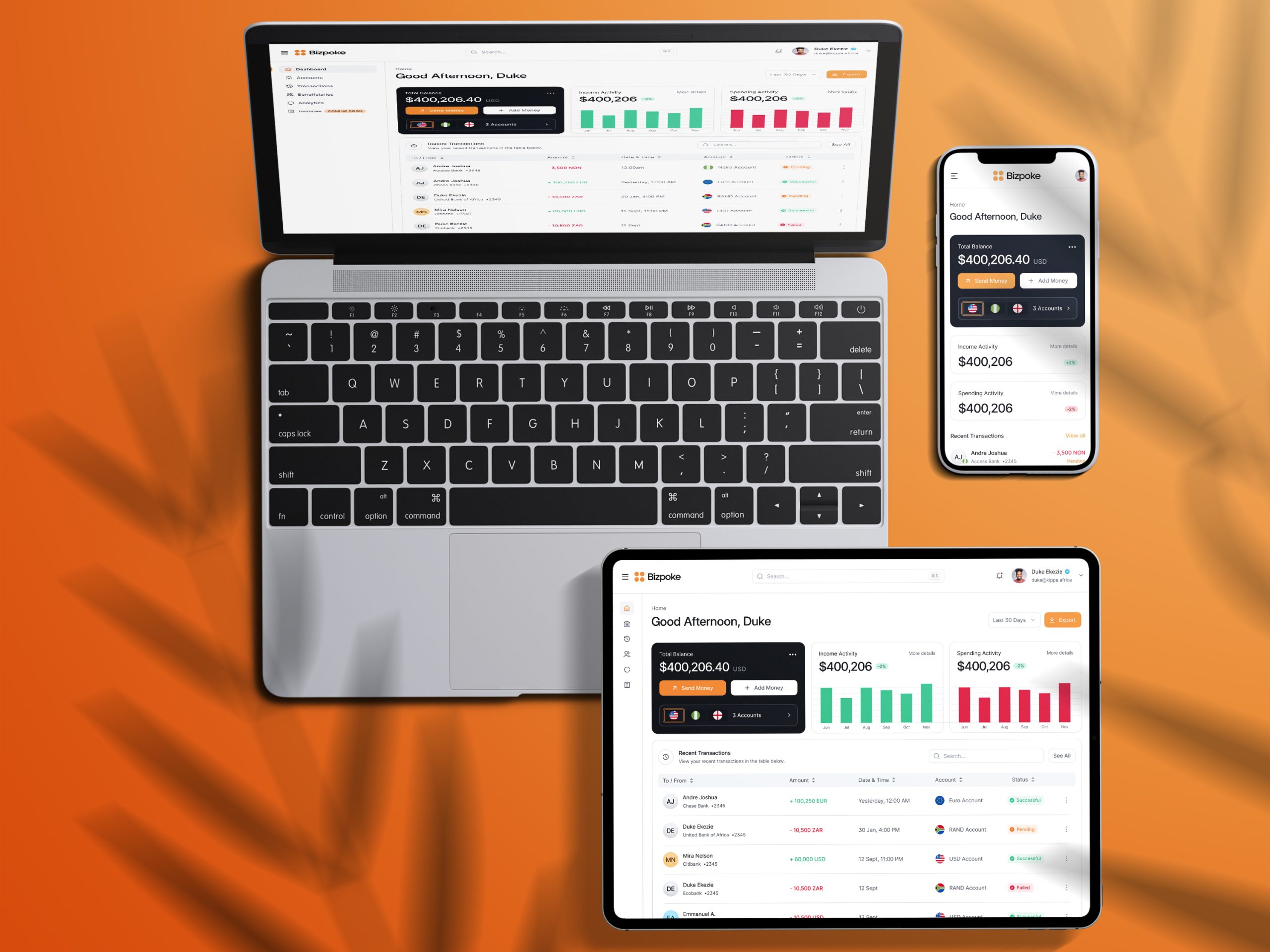
Ensuring that the product was fully responsive for mobile devices was a priority. I optimized the design for different screen sizes and devices, ensuring that the product was touch-friendly and easy to navigate on mobile. Performance optimization was also a key focus, enhancing load times and overall performance for mobile users to provide a smooth experience.
Outcome
This iteration of Bizpoke was to set strong foundations and build the brand, design language and a main first version of the product which the team could build further upon.
From Individuals, Businesses and Organizations especially Startups, Bizpoke has already gained quite a lot of interests with different user groups who have joined to be part of the MVP and early beta users.
