Research Information Architechure UI/UX Design Design System
Duration 3 Months
Deliverables High-fidelity Mockups User Research
Tools Figma, FigJam, Adobe CC Google Meet & Docs, Notion
Context
In response to user feedback and identified pain points during research efforts, Kippa Business has undergone a transformative unification process, merging Kippa Core (Book Keeping), KippaPay (POS), and KippaStart (Business registration and legalization) into a single, seamless experience. This case study delves into the challenges faced, the solution implemented, and the goals achieved through the unification process.
Due to the sensitivity of the project, this case study is heavily redacted to protect the client.
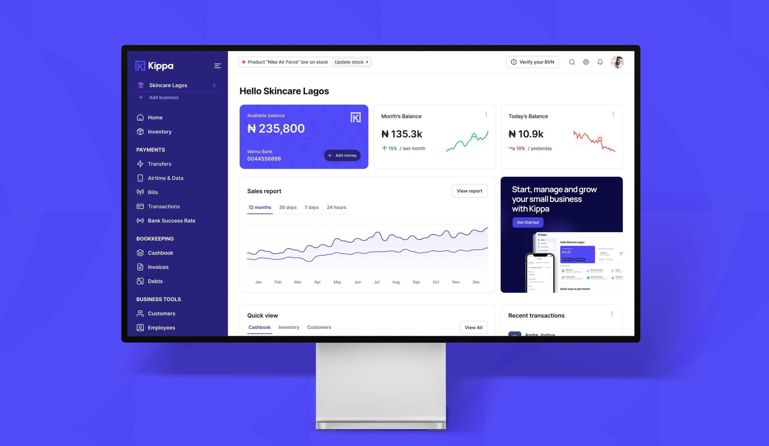
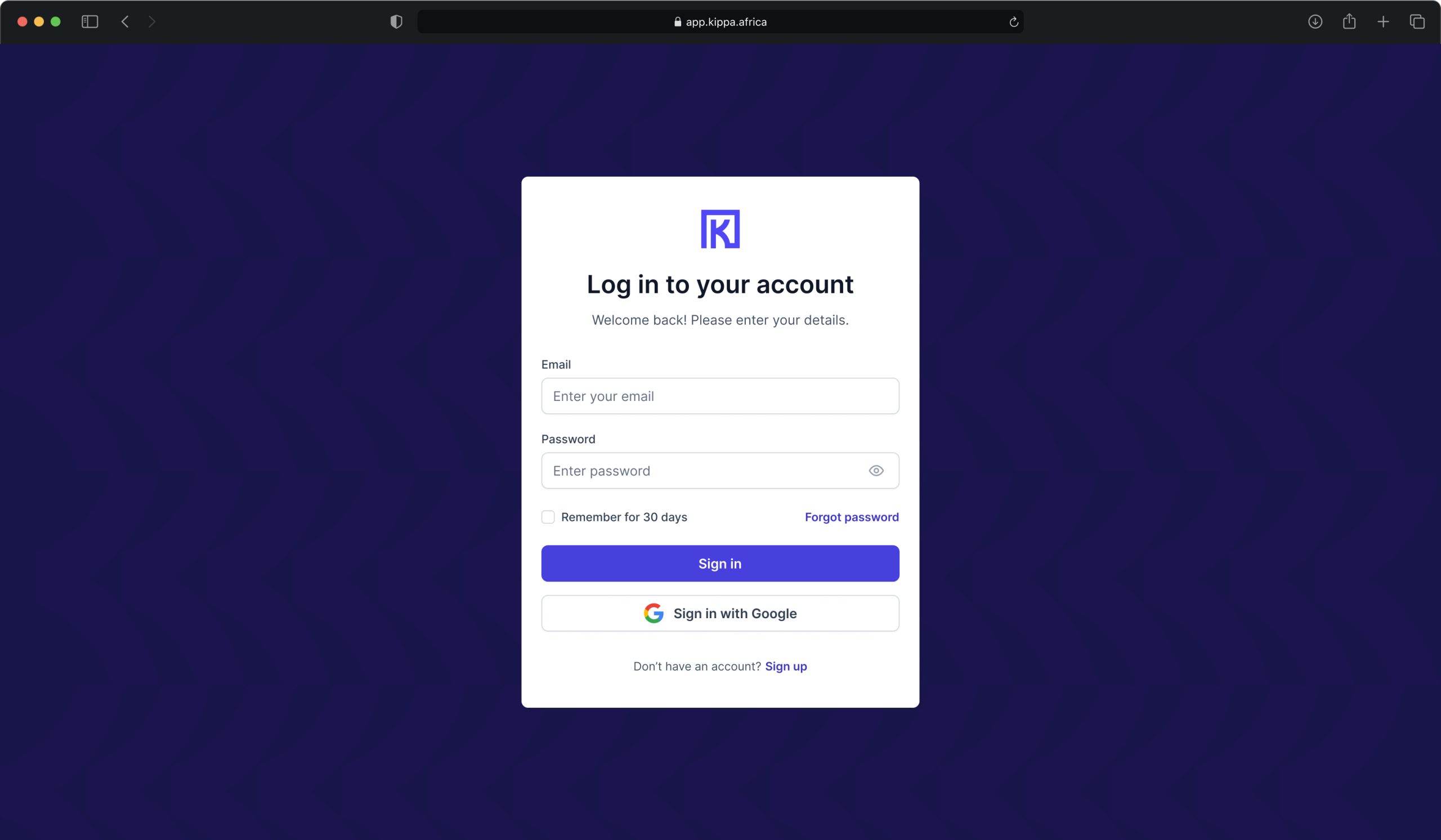
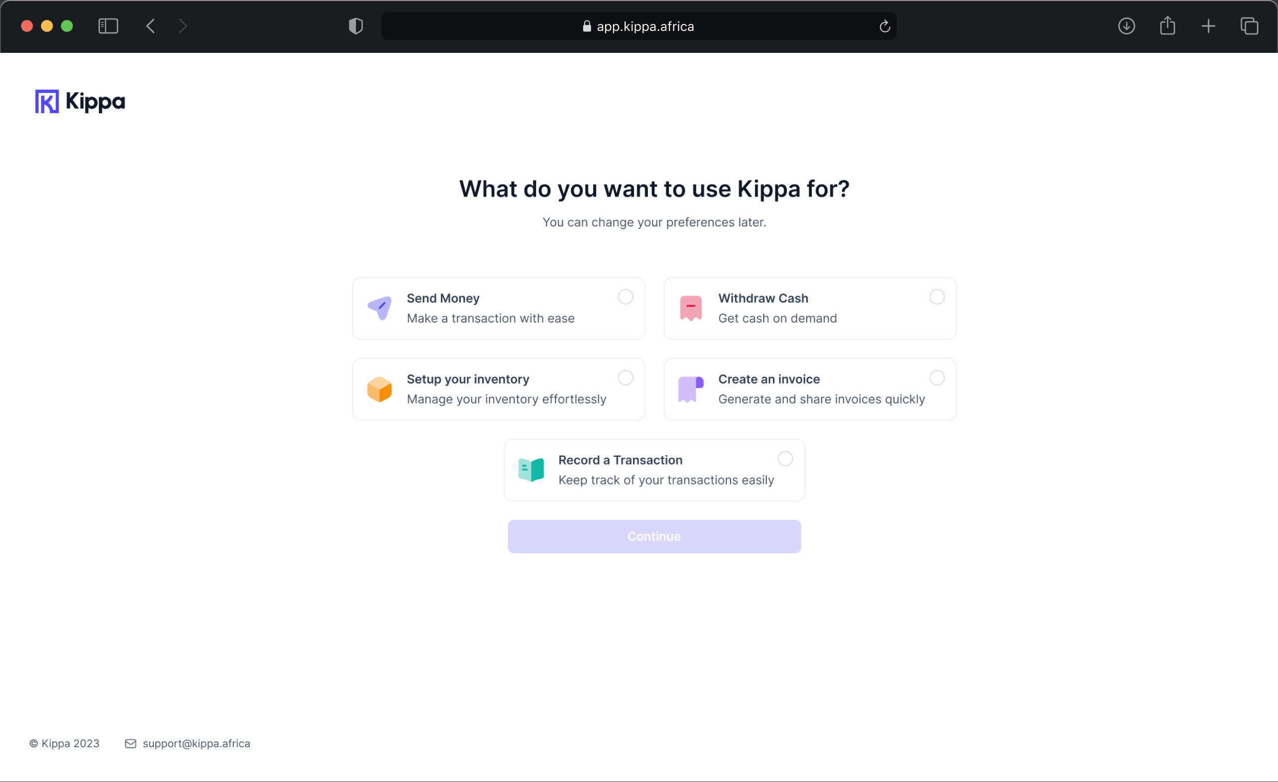
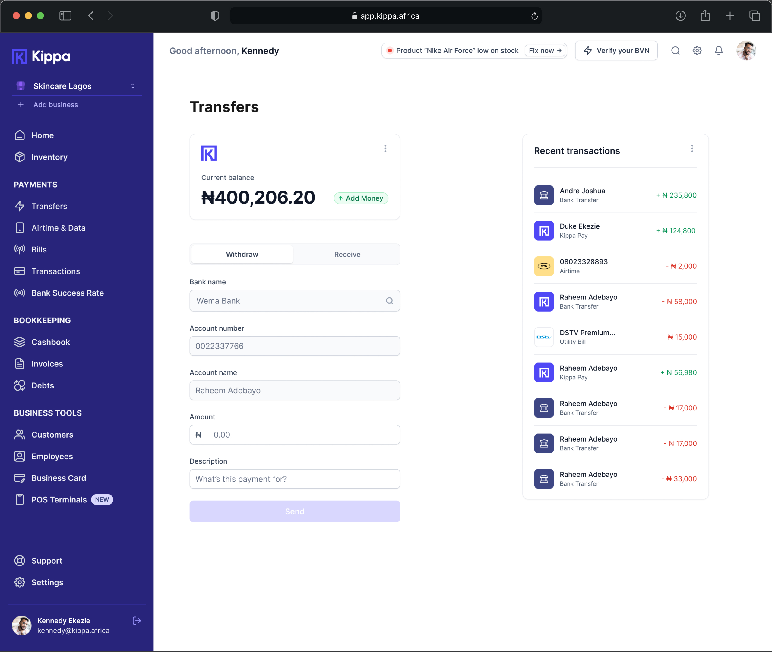
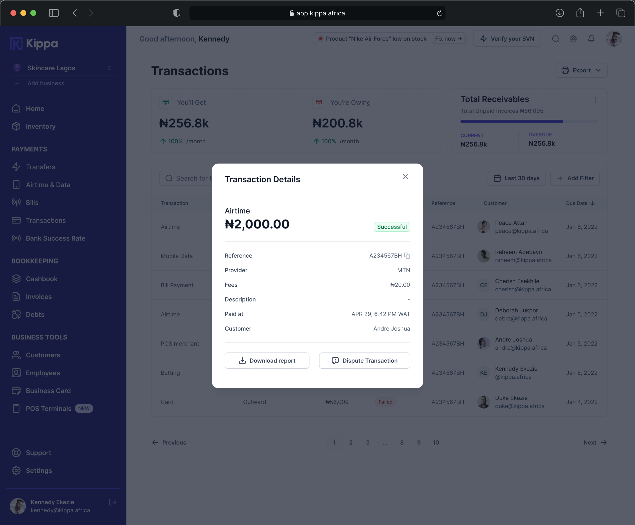
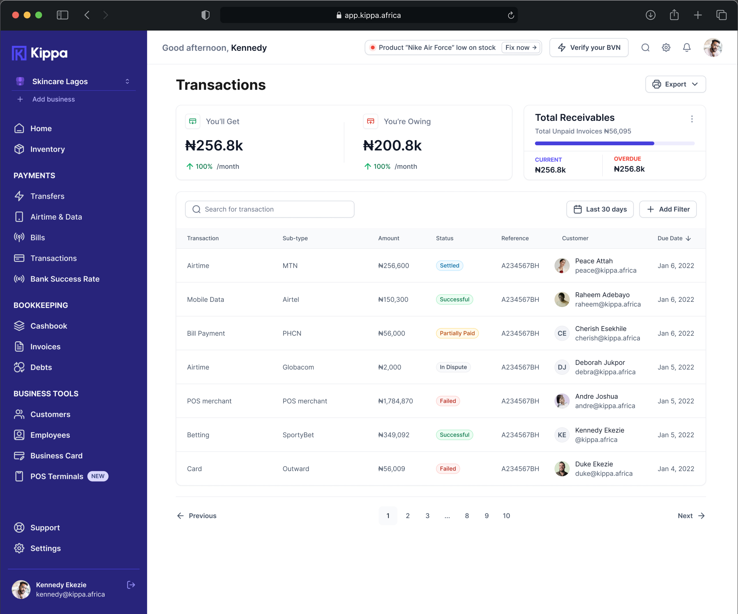
Kippa – Bookeeping App
Kippa – Bookeeping App
Kippa - Bookeeping App
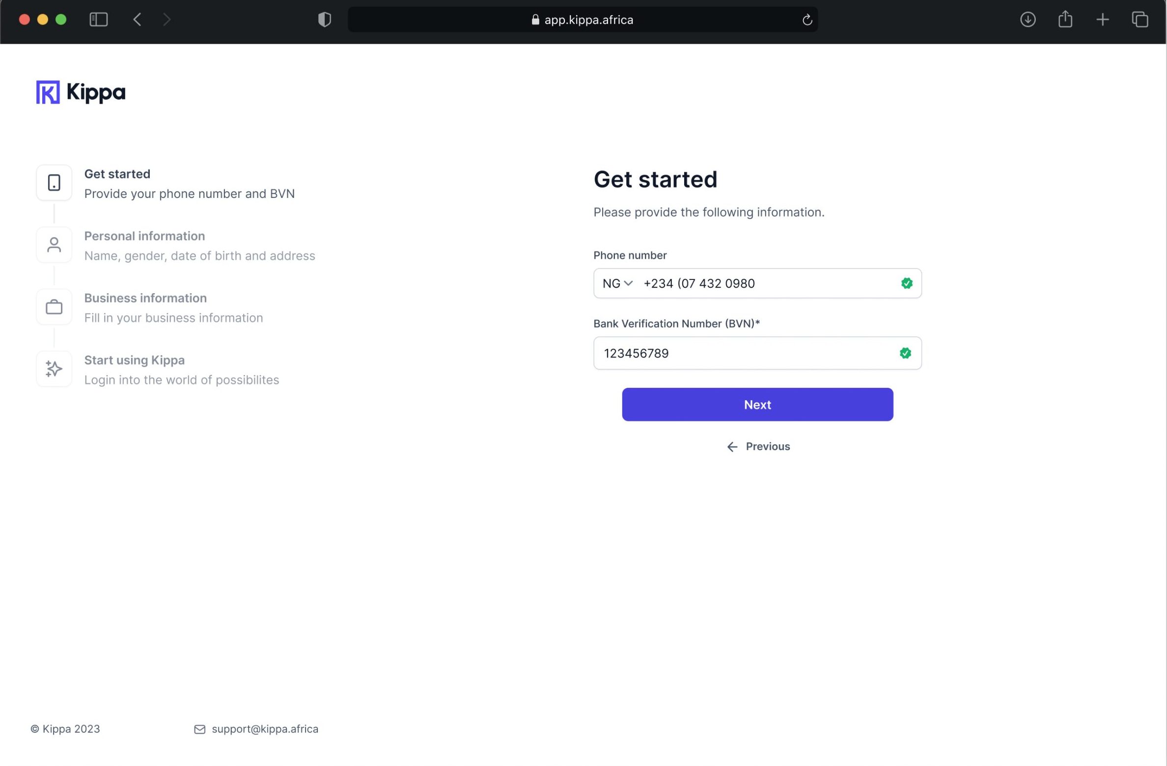
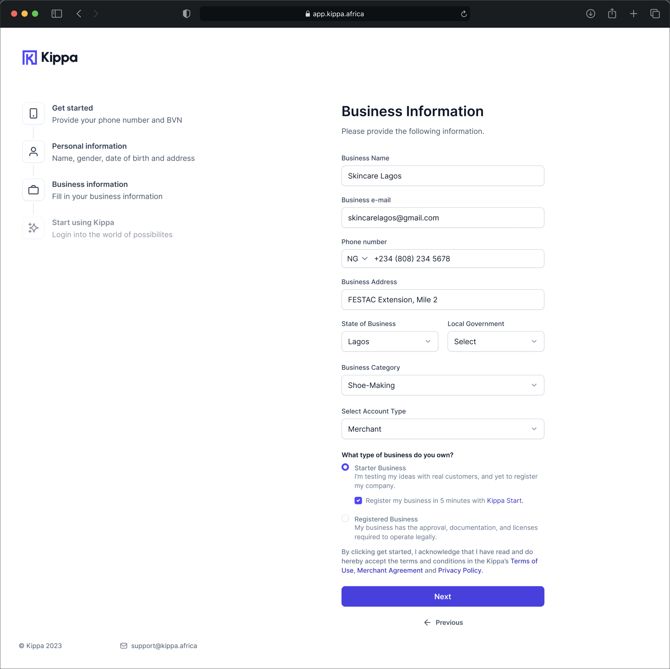
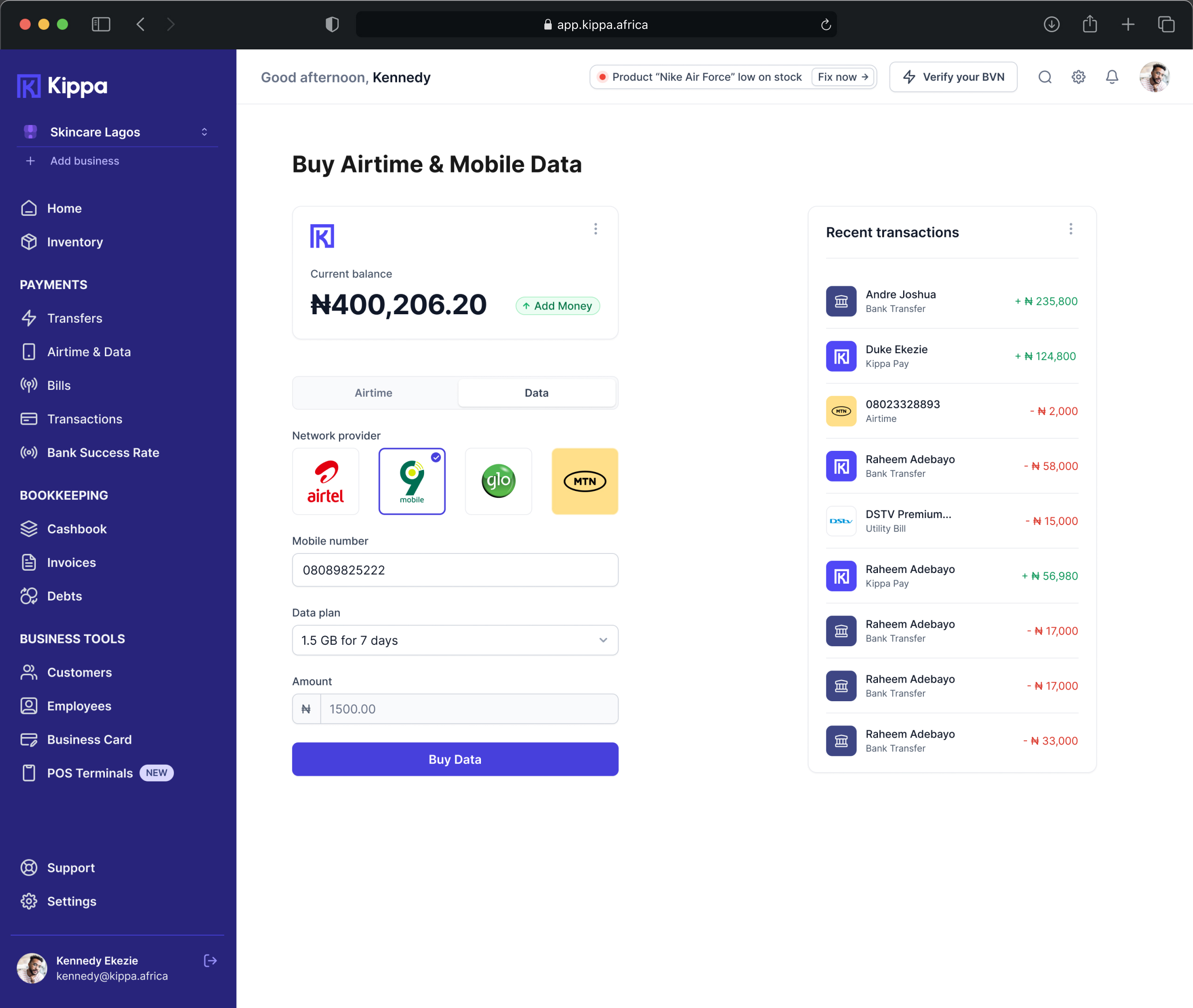
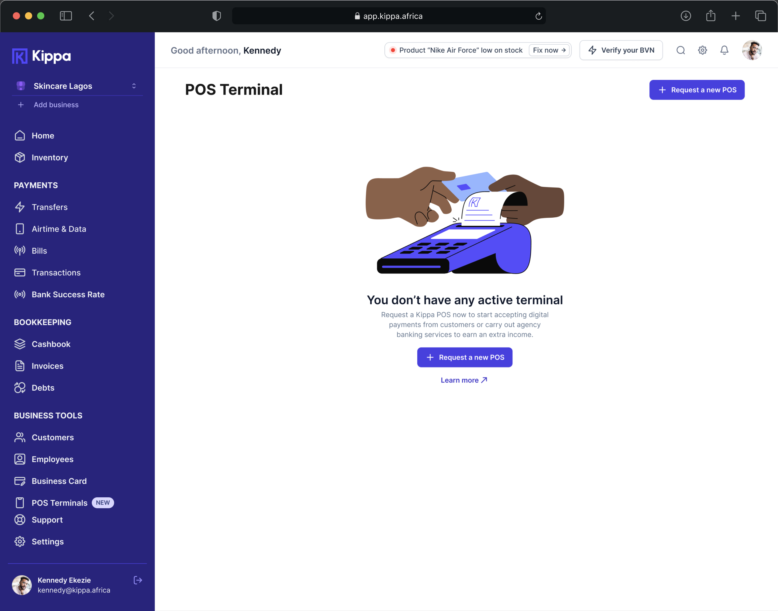
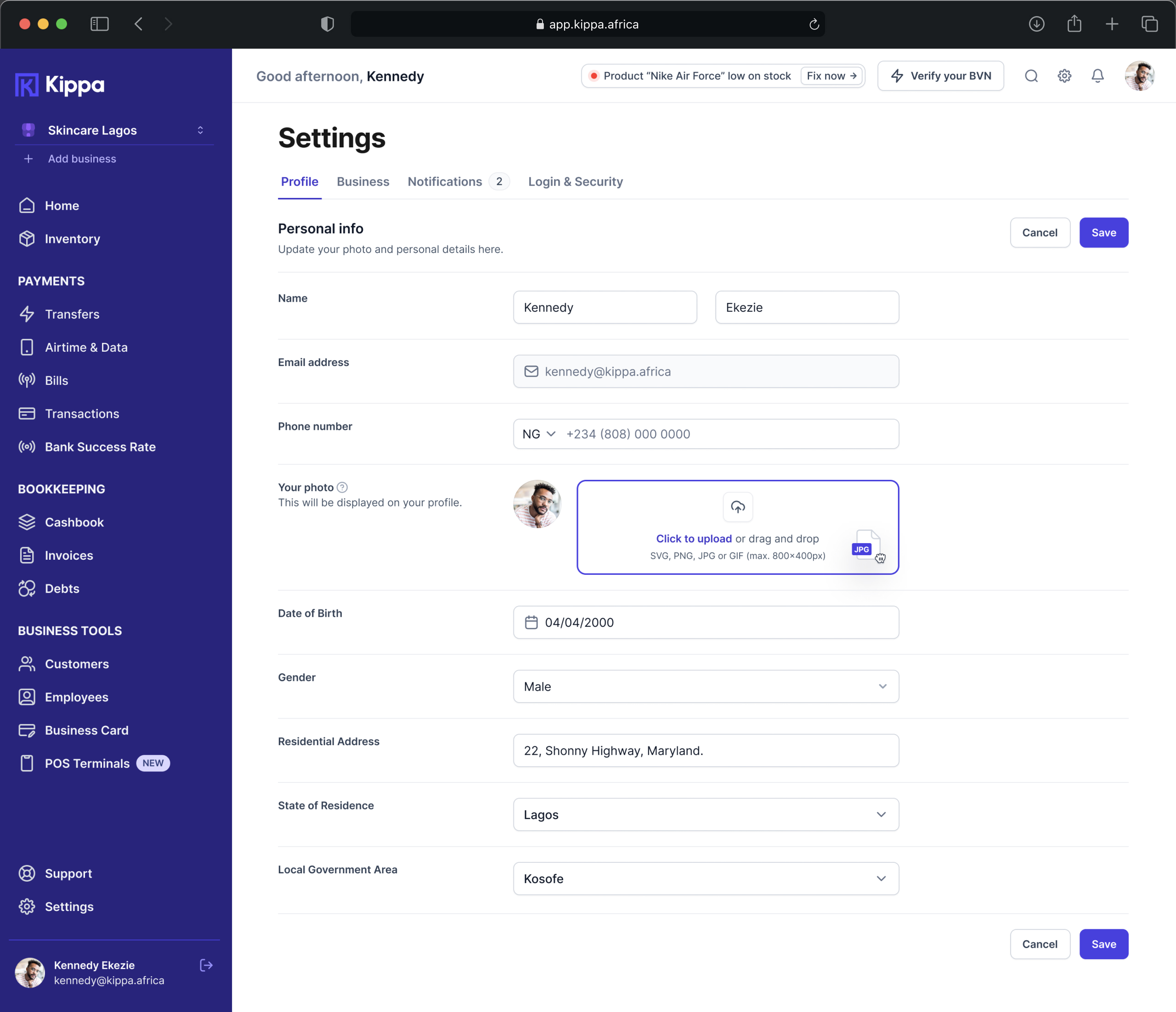
KippaPay – Agency Banking & POS
KippaPay – Agency Banking & POS
KippaPay - Agency Banking & POS
Challenge
The primary challenge faced by small business owners using Kippa services was the need to navigate between different applications to access the varied functionalities provided by Kippa Core, KippaPay, and KippaStart. This resulted in user frustration and inefficiency, as they had to switch between apps to perform different tasks related to bookkeeping, point of sale, and business registration.
Direct Contributions
As the UX Lead, I applied my expertise in design thinking methodologies to drive the design process, working as a Workshop Facilitator. I carefully planned and executed remote workshops, leveraging various design thinking techniques.
Through these workshops, I collaboratively identified design goals derived from problem statements, conducted Usability Studies, and developed User Personas. Additionally, I worked with the Product Manager to define the PRD for the product, ensuring its alignment with the business and user needs and expectations.
Outcomes
Throughout the project, we turned group discussions into tangible outcomes, identifying problem statements that transformed into actionable opportunities from usability, strategy, and brand awareness perspectives.
To achieve these results, we actively asked insightful questions, merged similar ideas, and subjected them to rigorous testing by considering various criteria. We also comprehensively analyzed complex situations, advocating for practical solutions. This design thinking process involved rationalizing ideas and focusing on workable solutions. Additionally, we utilized company principles as a parameter to evaluate decision-making processes.
Solution
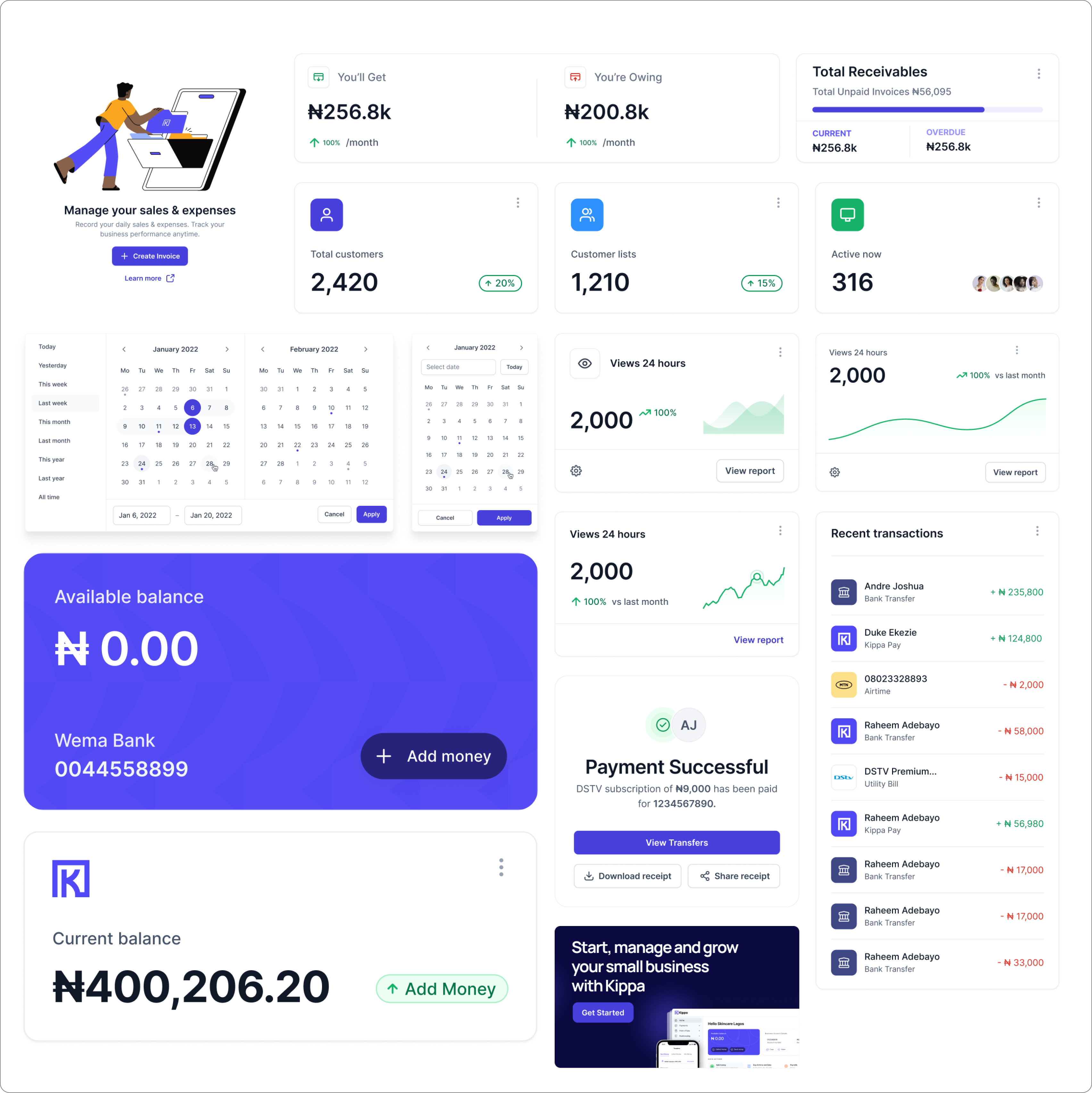
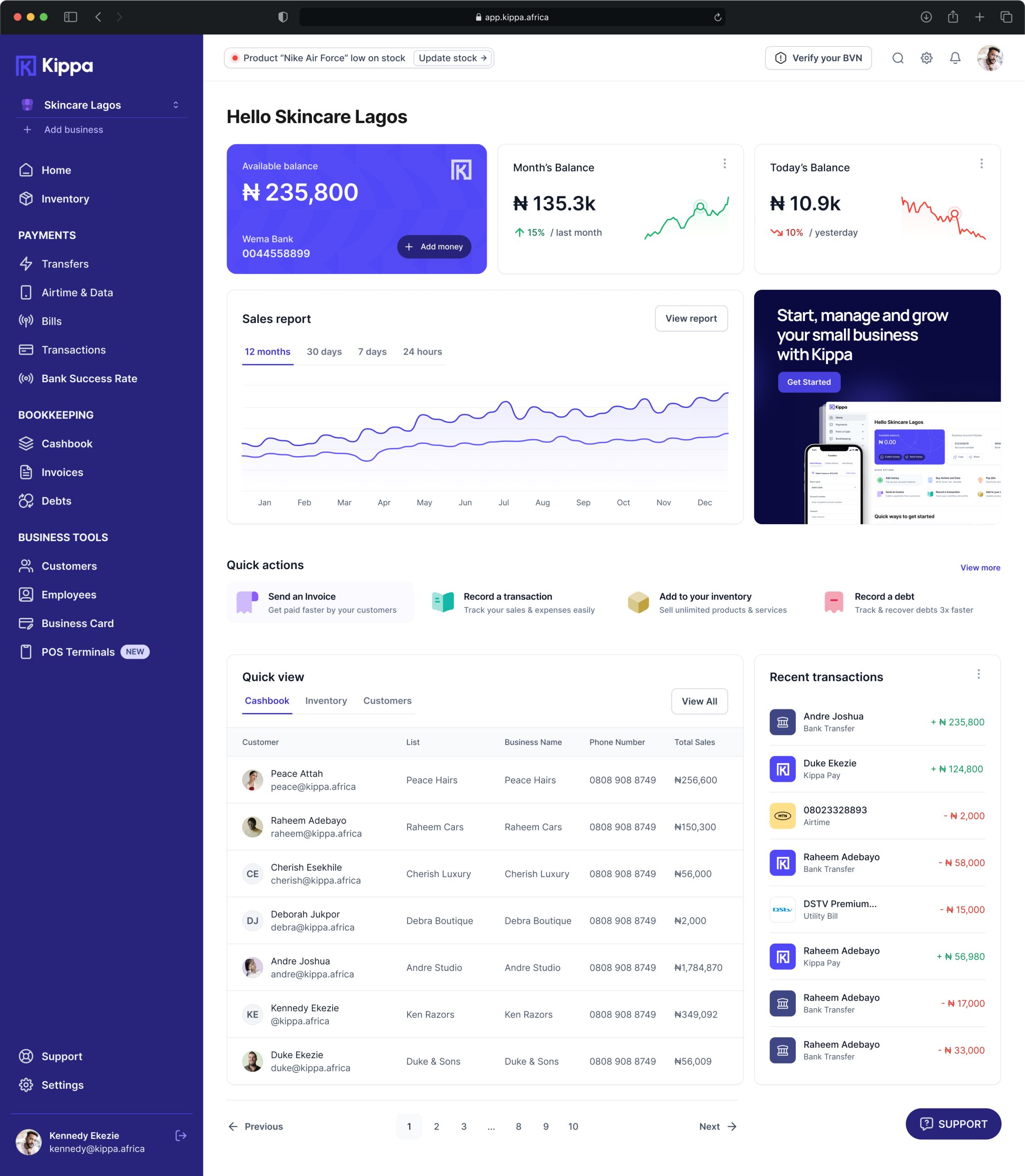
The solution to address this challenge was the unification of the three distinct products into a single, comprehensive application. The objective was to create a user-friendly, accessible, and efficient platform where small business owners could seamlessly manage their bookkeeping, utilize the POS system, and access necessary registrations—all within one unified interface.
Goals
The overarching goals of the unification process were defined as follows:
User-Friendly UI: Develop an intuitive and user-friendly interface that facilitates easy navigation and interaction.
Accurate and Straightforward Information: Ensure that the application provides accurate and straightforward information, minimizing complexity for users.
Desktop and Mobile App Compatibility: Create a unified experience that is accessible on both desktop and mobile devices, catering to the diverse preferences of users.
Simplified KYC Process: Implement an easy Know Your Customer (KYC) process to enhance user onboarding and verification.
Maintain App Flow: Preserve the existing app flow for both web and mobile applications to maintain familiarity for existing users.
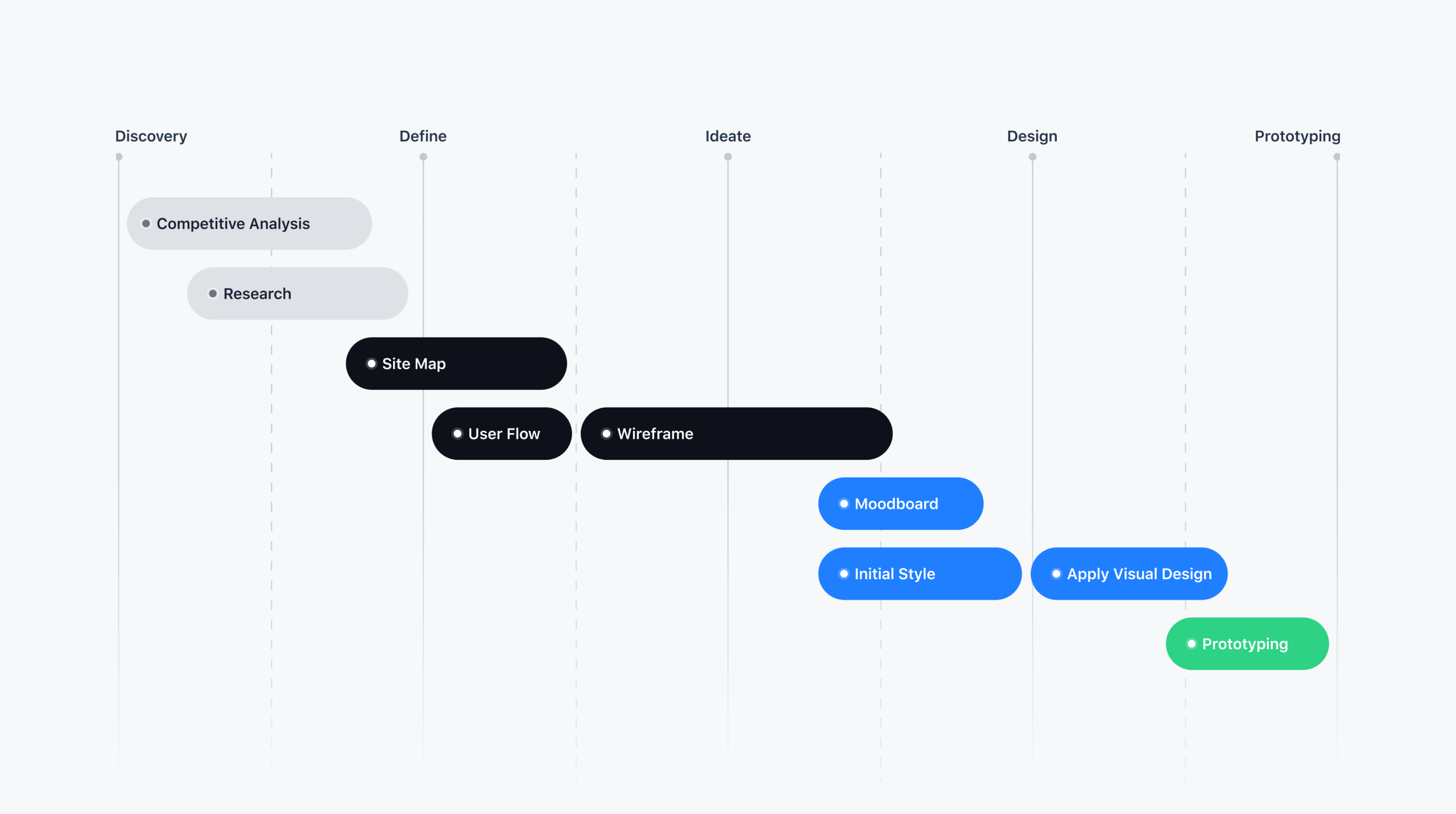
DESIGN PROCESS
1. Facilitating Workshops
Ensuring that all stakeholders were on the same page, I planned and conducted remote and in-person workshops. These served as a means to comprehend our users, identify real problems to solve, facilitate sessions to generate potential solutions, and analyze the effort versus impact to pinpoint the best opportunities.
I organized and guided the following remote workshops:
Empathy Map Workshop By empathizing with their experiences, we gained valuable insights that guided our decision-making process.
How Might We Workshop By reframing problems into actionable statements, we encouraged creative thinking and brainstormed innovative solutions.
Ideation Session By harnessing the collective intelligence of our team and stakeholders to generate a wide range of ideas, we explored different avenues, pushing the boundaries of innovation.
Lightning Decision Jam By utilizing structured decision-making techniques, we efficiently narrow down our options, identifying the most viable solutions.
We provided the necessary insights to make informed decisions, allowing us to understand the users’ needs and continuously refine the findings. As a result, critical stakeholders successfully identified critical user problems and generated innovative solutions to address them effectively.
2. Figuring out the state of the market
Before proffering solutions to this problem, the team and I began by analyzing products that offer solutions to the same problem. The aim of this was to gain insight into their product while focusing on their strengths & weaknesses to discover any opportunities or gaps that may exist within the market. The criteria for my analysis included:
Figuring out how the state of the market is and how the competitors operate helped in understanding how things work, the experience for the SMB owners and how they get onboarded. These was really helpful gaining all these level of insight, but this left a question for us as a team; Why do the competitors do things the way they do? How do the users respond to these features and experiences being offered by the competitors?
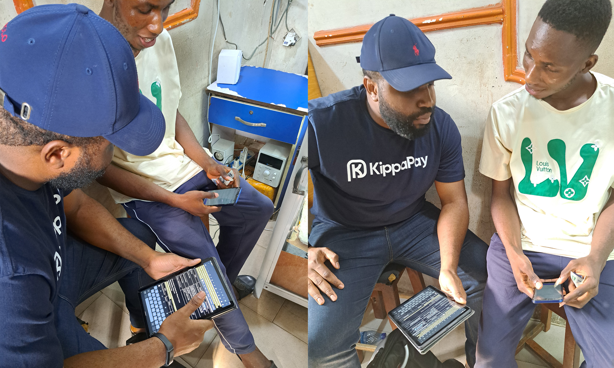
This was the driving force to help uncover more insights as the team and I journeyed next into an unmoderated interview session with a few users our Customer Success team helped us access.
3. Checking in with the users
To gain more insight, we rolled up our sleeves and dug into the heart of this problem. We started out talking to people while asking them salient questions.
These questions aimed to gather valuable user insights and shape improvements to enhance the overall Kippa experience for small business owners and also identify problems they might face.
As a result of these interviews and data sourced from relevant reports, we discovered that users frequently rely on word-of-mouth to discover Kippa, with a strong preference for its bookkeeping and debt reminder feature, while the integration of invoicing, POS, and business registration has streamlined workflows, though users express a desire for improved guidance on advanced features.
Users face challenges in reconciling transactions accurately, particularly when managing multiple shops within the app. This suggests a need for enhanced transaction tracking.
The majority of users primarily access Kippa through mobile devices, but more business owners were soliciting for a desktop version.
Users anticipate Kippa evolving to offer additional financial services, such as access to working capital loans and digital savings, aligning with their growing business needs.
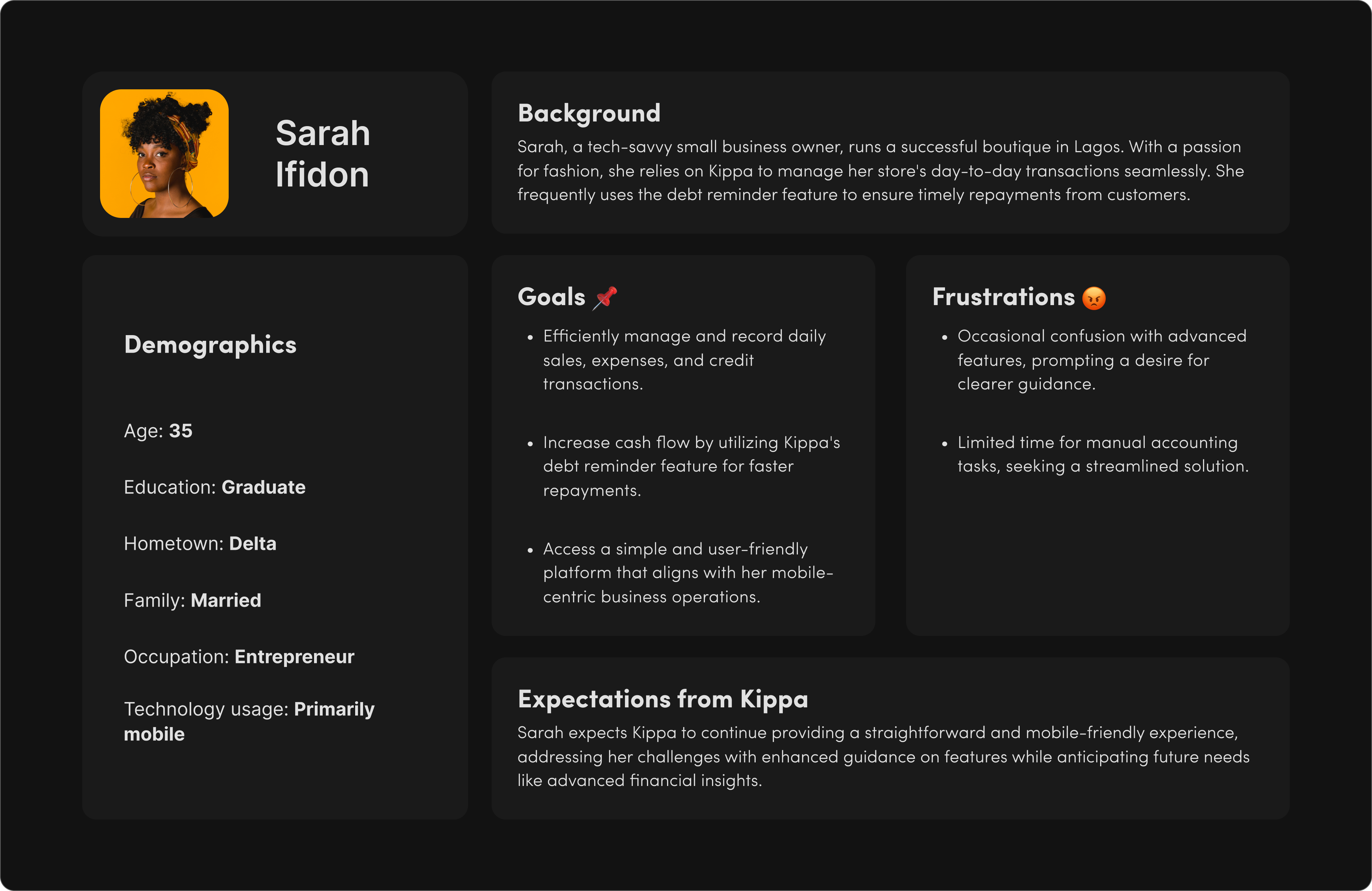
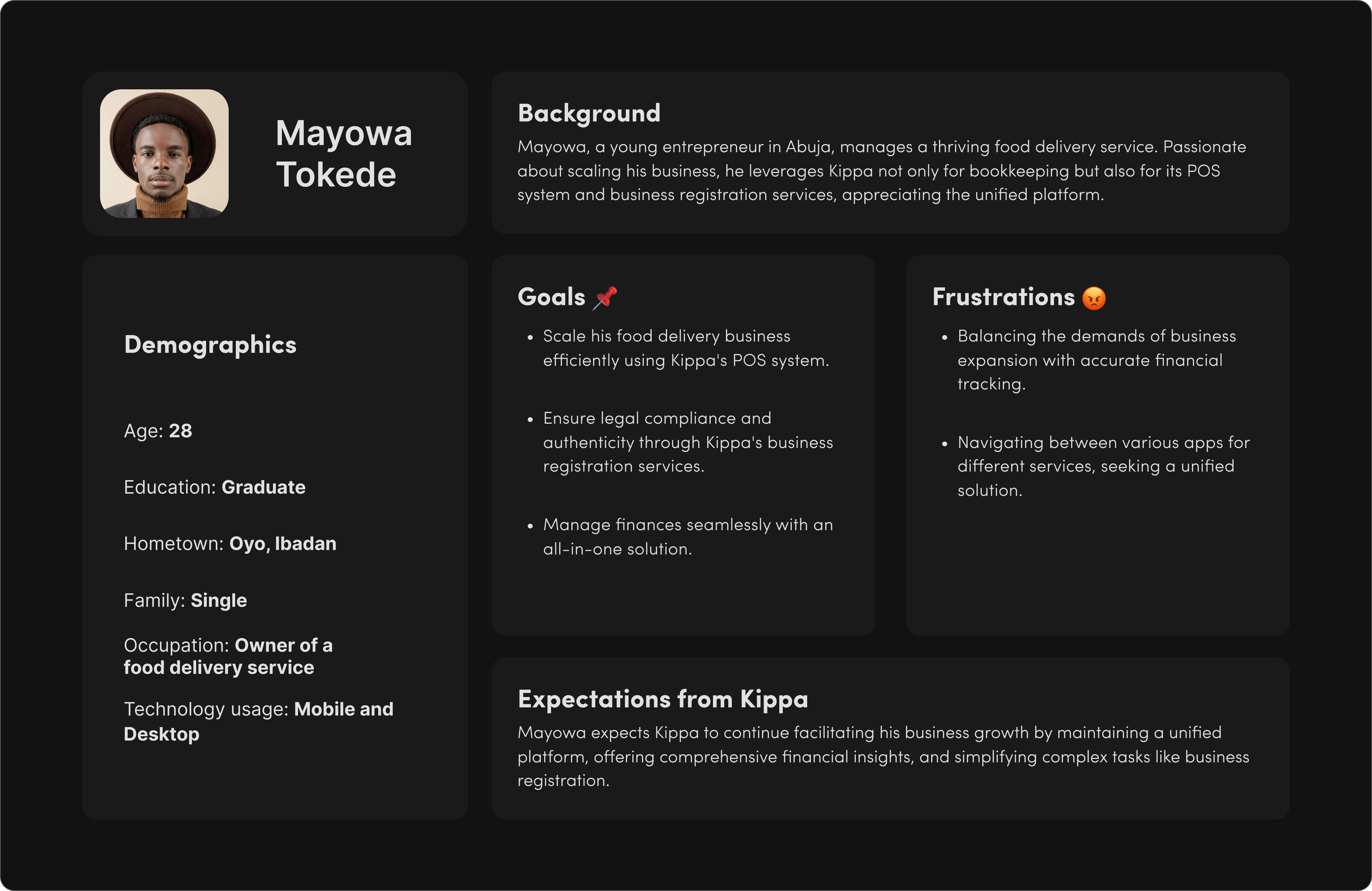
4. Creating personas
At this point, we had enough data to help us understand what these users were facing, but analyzing all of these data requires some form of guidance for a start, and narrowing all of these into a user target group was the best thing for the team to make sense of everything:
Based on the gathered insights from data to workshops, I created personas defining the needs, behaviors, and goals. These personas represent fictional user profiles. The information for creating the personas was collected from user-centered workshops, where we identified the users’ challenges and pain points. The knowledge of the target audience greatly assisted in the right Product Requirement Document.
We (the team & stakeholders) had a series of meetings where we used the research findings to craft our MVP, this led the PM to create a well-structured PRD detailing features and what needs to be built.
With this, it was clear what needed building, and breaking the PRD down into bit-sized steps was the ideal next step so it’s easier for my fellow designers to understand the intricacies of the app, its user personas, and user flows.
When I’m designing a digital product for a long project, two questions always come to mind when planning it: “How long will it last?” and “Is it scalable?”
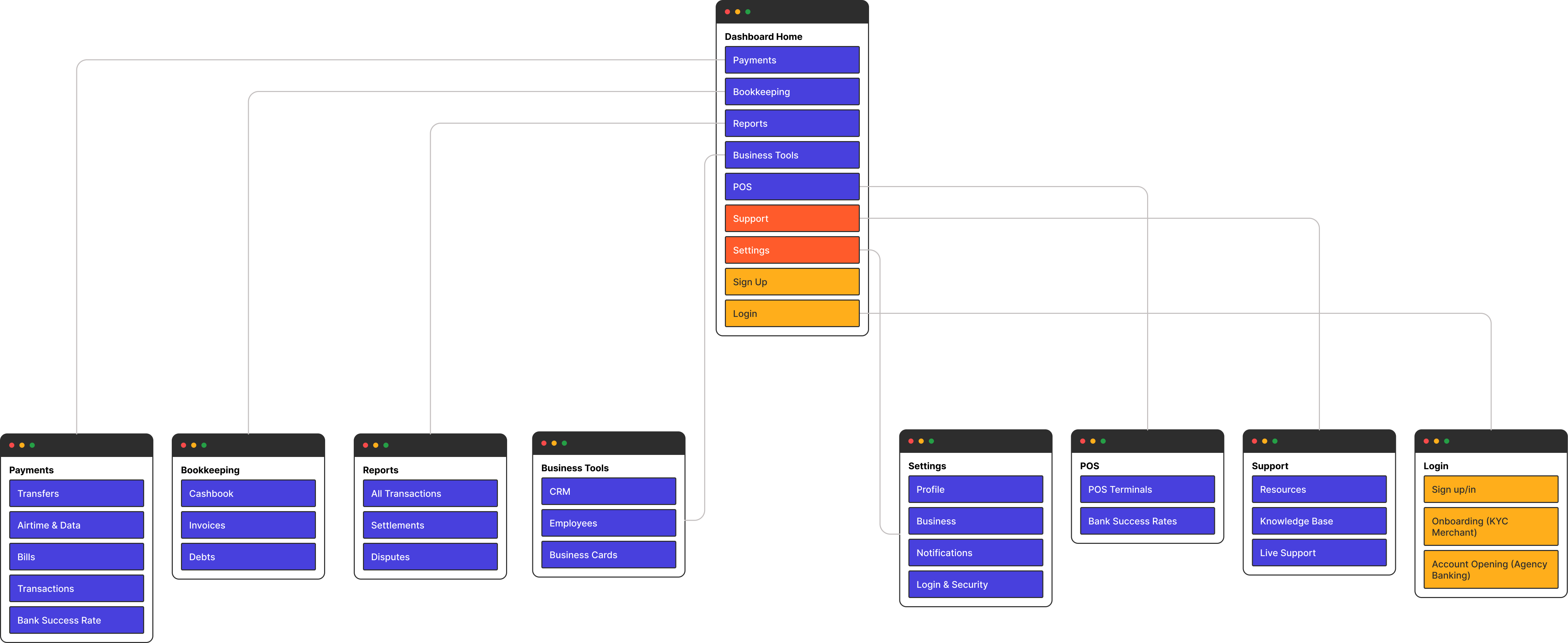
I started by building a comprehensive components library in Figma that would later reflect in various parts of the app, i.e., colors, typography, setting the grid etc. This included icons, buttons, form elements, error and empty states, show cards and content cards.
Kippa Business was built to accommodate scalability, so components can work well alongside each other, at the same time, render well on various device resolutions.
Creating a product with a clear identity that resonates with our target audience was very important while working on this project. The aim was to create something that our users and connect to and find satisfying while using the product on a day-to-day.
Designs are used by people and we needed to test ours out on a few. We tested out our solutions while paying attention to how easy it was for users to navigate. We identified some pain points with the user flow which we improved on.


 View Test Documentation